Case study·Mobile·Community·Feb — Mar 2021
I researched and designed Lili, a women-only community platform, from 480+ survey responses to four MVP features in beta.
Status: shipped to beta. I was freelance and my part ended at handoff, so I have no post-launch data.
- My role
-
- Ran the research: a 480+ respondent survey, synthesised into four personas
- Prioritised the MVP down to four features the team could actually build
- Designed the flows and UI, then documented them for handoff
- UX researcher and designer, freelance, with the founders and engineering
- Impact
-
- All four MVP features shipped to beta
- 480+ respondents and four personas gave the founders an evidence base they did not have
Women's communities were everywhere — the tools for them weren't.
An entrepreneur group of women came to me with a brief: build a Minimum Viable Product that promotes a safe space for women to share and learn from each other. The brief sat against a specific backdrop — the World Economic Forum was reporting that women had been hit harder than men by the COVID economy, often working in low-paid, undervalued, insecure jobs. The existing social tools weren't built for the conversations these communities needed to have.
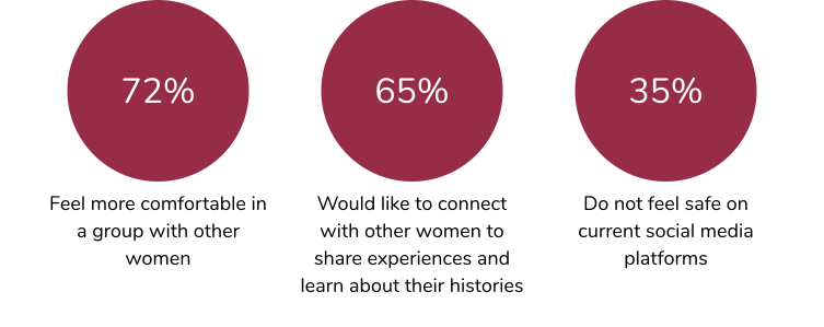
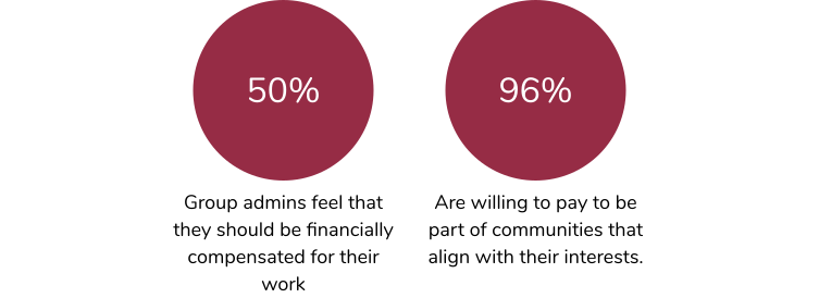
480+ women, two distinct sets of needs.
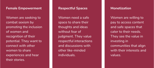
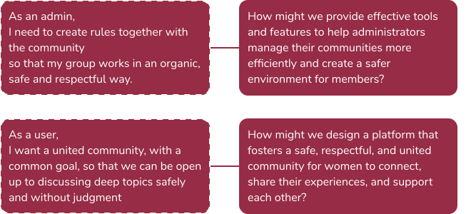
Discovery combined quantitative survey data with qualitative interviews — admins and members of online and offline groups. The volume of responses exposed clear divisions: the people running communities and the people participating in them needed different things, and the existing tools served neither side well.
Four women, four different relationships to the community.
The research surfaced four distinct profiles — the engaged participant, the curious learner, the admin-creator, and the leader who turned her group into a safe space for others. Each anchored a different set of design decisions.
- Valentina (32, journalist) — engaged participant. Values trust and safety while engaging.
- Anna (29, entrepreneur) — curious learner. Needs easy access to relevant content.
- Leticia (35, psychologist) — admin and content creator. Needs financial support for the time she invests.
- Mayara (25, artist) — leader of a self-created safe space. Needs help organising community activities.
Four features, picked for impact and feasibility.
With the team, I worked through flows and wireframes against development complexity and user feedback. Four features made the MVP cut — each tied to a specific pain point from research, each tested before committing.
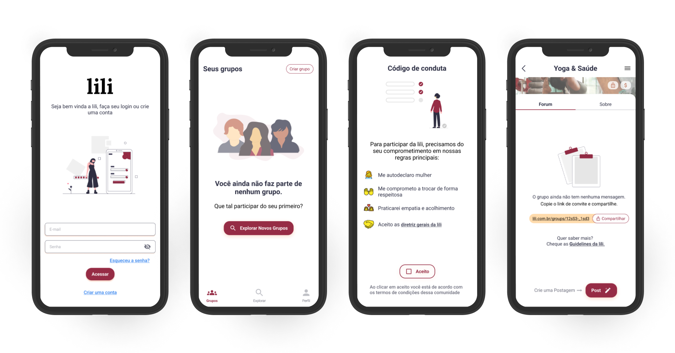
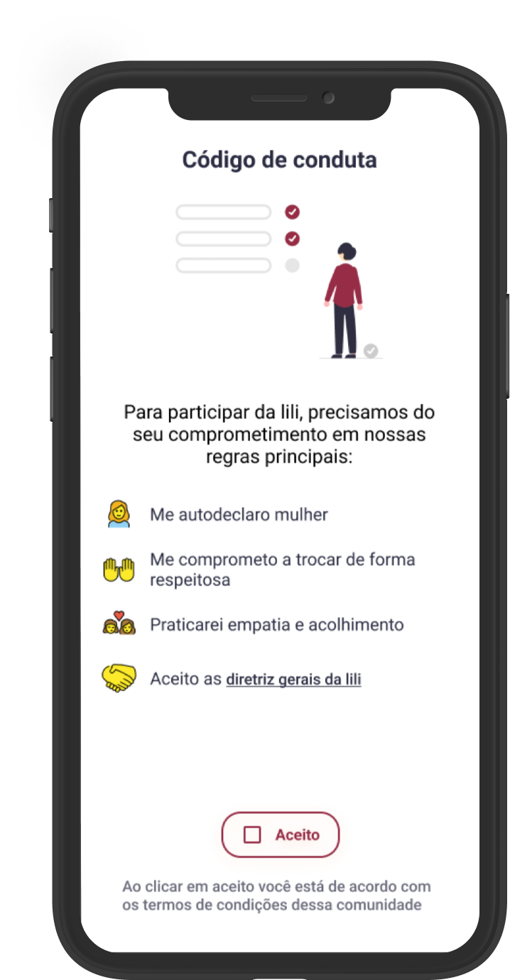
- Gender validation by auto-declaration — document verification was a barrier in testing. Auto-declaration kept the safe-space promise without locking new members out.
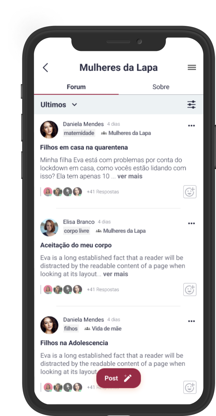
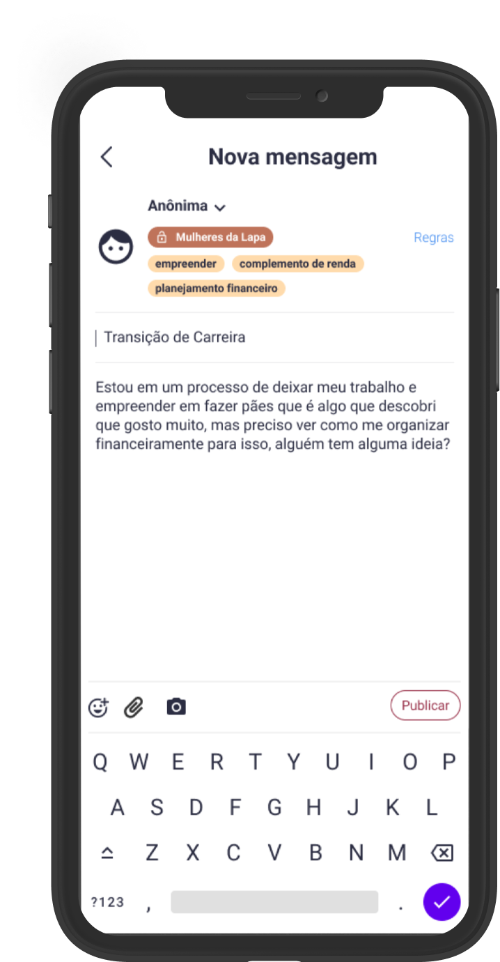
- Tagged, threaded interactions — research showed users couldn't follow subjects in existing chat tools. Tags, threads and group timelines made discovery easier.
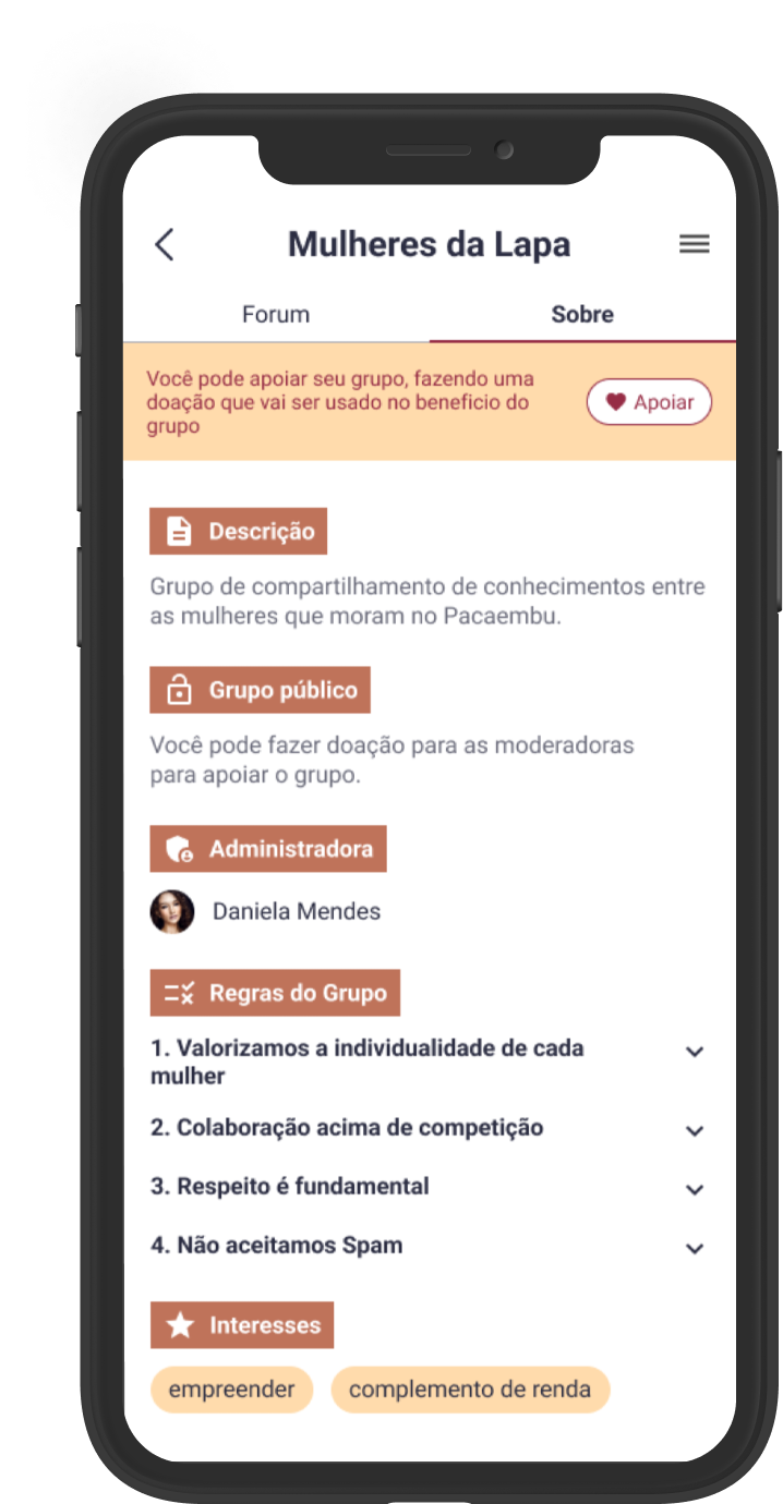
- Groups with admin monetisation — admins could open or close groups, accept donations, or run private groups by subscription.
- Anonymous messaging — for sensitive subjects, a clear opt-in to share without identity.
Shipped to beta — and the point where my engagement ended.
I delivered designs and specs to the engineering team and stayed on for tweaks and questions through to the beta release, which went out to real users. Before handoff, I worked with the founders to define what success would look like — so the MVP shipped against a measurable bar rather than a vague one. These are the targets we set for the beta:
- 5+communities supported, each with 100+ users signed up
- 50%of users participating in two or more groups
- 50%of active users interacting at least twice a week
What designing for safety taught me.
"Safe" had to mean something. For every feature, from gender validation to anonymous messaging, I asked whether it actually made someone safer or only sounded like it did. That question cut several ideas from the MVP.
Admins and members needed different things. The research produced two problem statements, not one — and the feature set had to answer both, or the platform would only work for half the people on it.
Four features was the right number. Choosing them against development effort and what users actually asked for gave the team something buildable. Saying no to features I liked was the hard part.
Next case study