Case study·Web·Conversion · Healthcare·2020
Amo Bem Estar's revenue depended on a sign-up that people abandoned. I rebuilt it around what three research methods all pointed at.
Status: validated with users and handed to development. The A/B test never ran — engineering ran out of capacity.
- My role
-
- Triangulated three sources: Google Analytics, a heuristic evaluation and user interviews
- Built the persona and journey, then redesigned the sign-up flow around the leak
- Validated the new flow in moderated usability testing before handoff
- UX researcher and designer, freelance, embedded with the founders
- Impact
-
- Three independent methods converged on the same diagnosis — not one method's guess
- A flow validated with users and specified for development
- The founders learned where the sign-up leaked, not just what to change
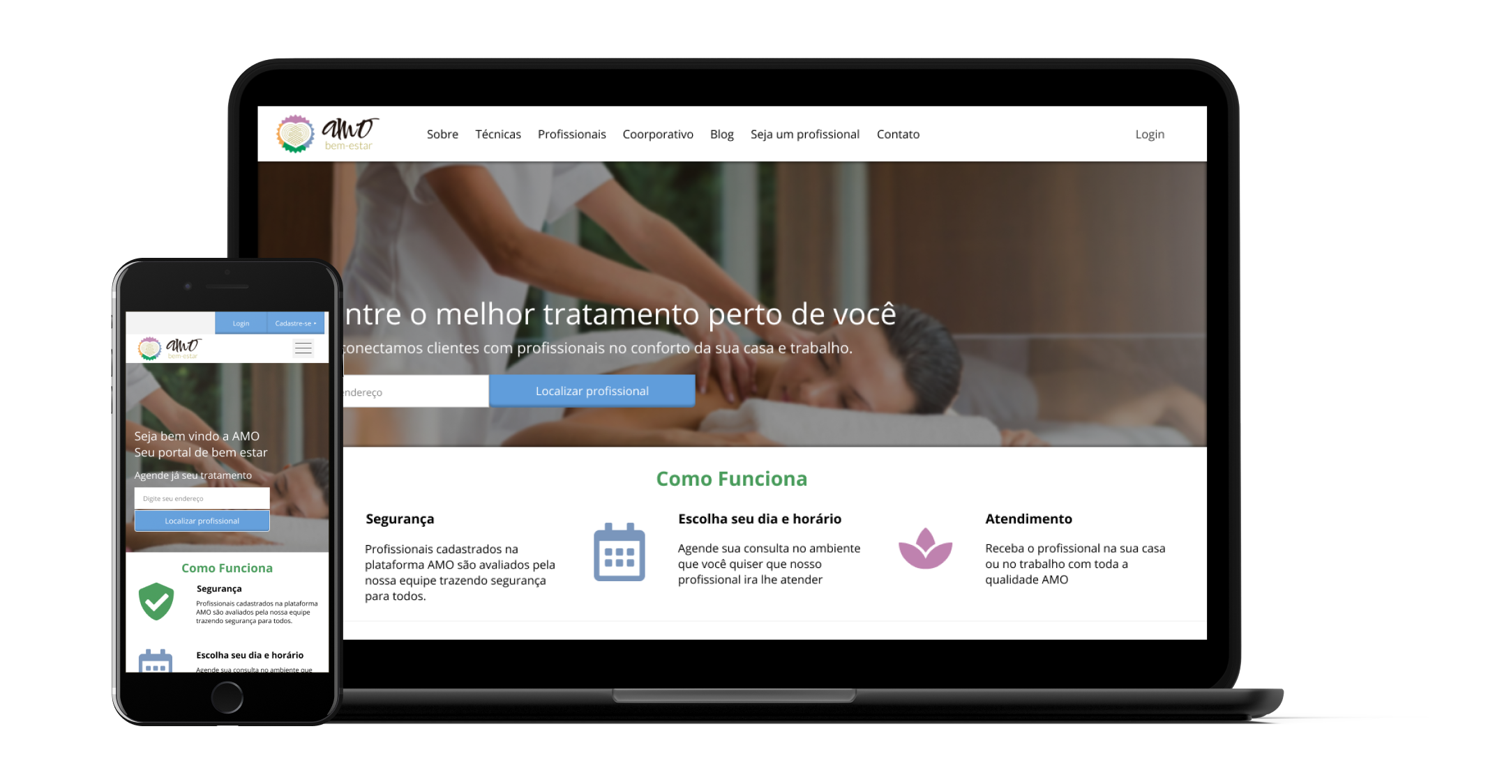
Revenue depended on a sign-up that people kept abandoning.
Amo Bem Estar is a Brazilian startup offering wellness services. Their revenue model relied on massage professionals subscribing to be discoverable — but the sign-up conversion rate kept stalling. Looking at UX best practices, competitor flows, Google Analytics data and direct interviews, the problem narrowed down quickly: the registration process itself was the friction.
Three sources, one converging story.
I worked the problem from three angles in parallel — qualitative interviews to understand intent, Google Analytics to see actual behaviour, and a heuristic evaluation against Nielsen Norman's principles to find the design debt in the existing sign-up.
- Competitive analysis — international and Brazilian competitors, mapped against SWOT to find where Amo could lead and where it was falling behind.
- Google Analytics — 3 months of data — acquisition channels, top devices, top pages, bounce rates and the funnel. 53% mobile, 45% desktop traffic.
- Field research — surveys and remote interviews with massage professionals to understand their challenges joining the platform.
- Heuristic evaluation — Nielsen Norman heuristics applied to the existing sign-up, scored and ranked by severity.
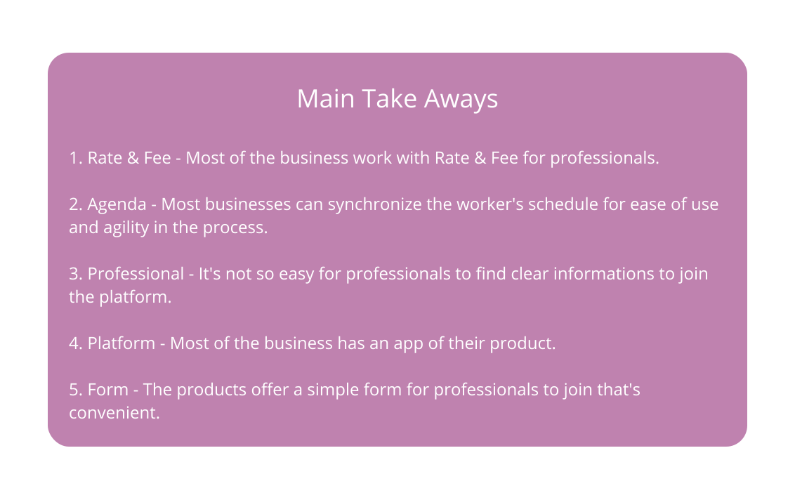
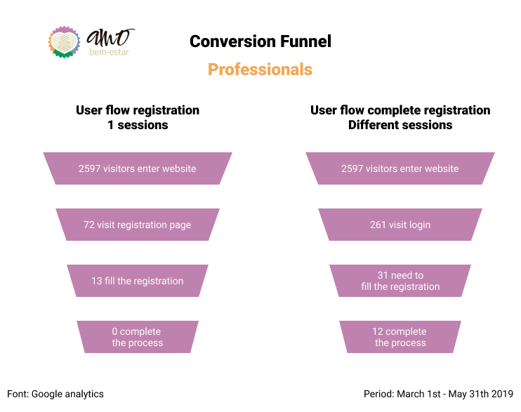
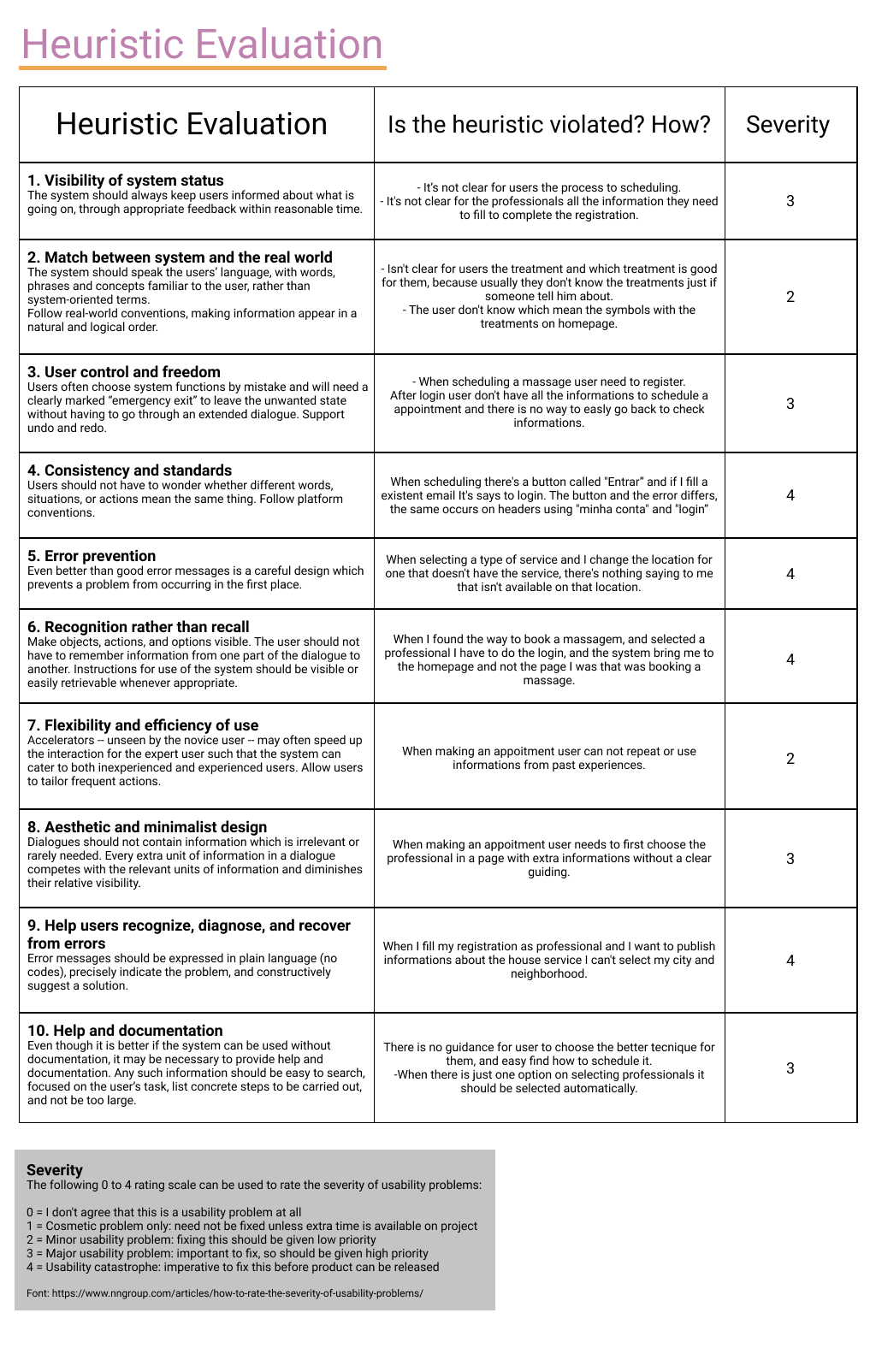
Persona, journey, then a shorter flow.
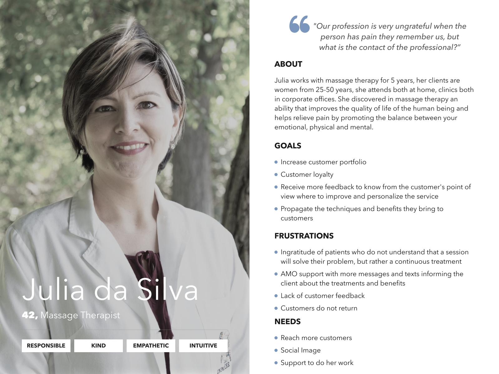
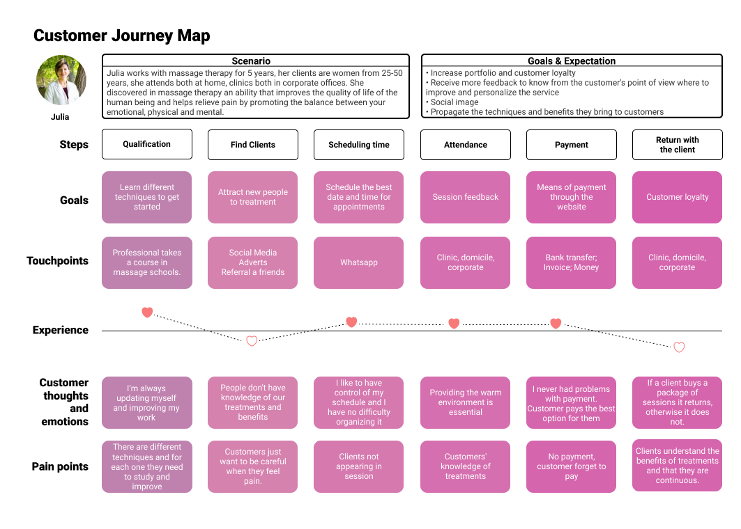
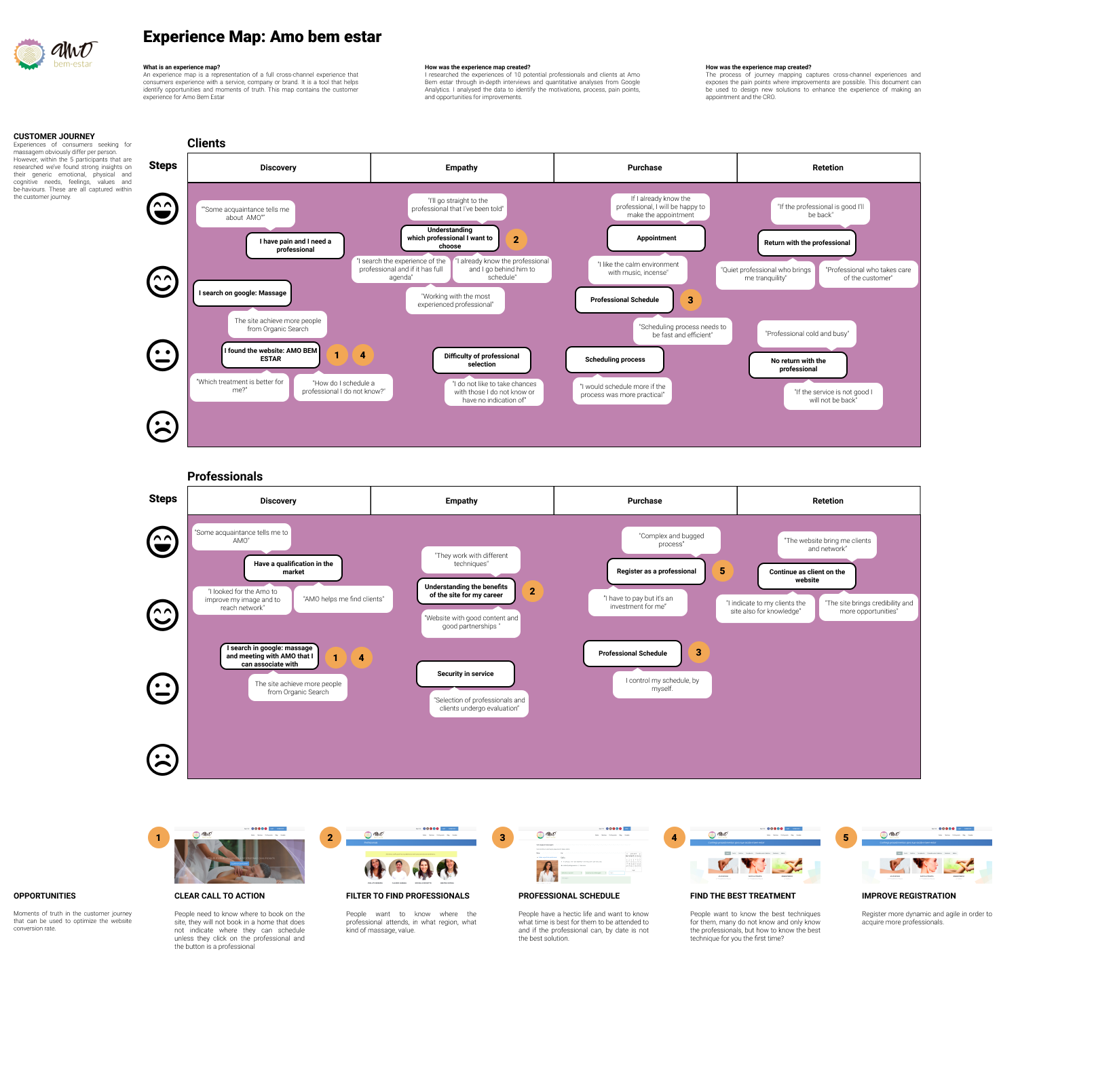
I anchored the work in Julia — a composite persona drawn from the interviews, a massage therapist with goals, frustrations and a specific reason to subscribe. From there, I mapped her current journey, layered it with an experience map across channels, and used that to argue for the cuts the new flow needed.
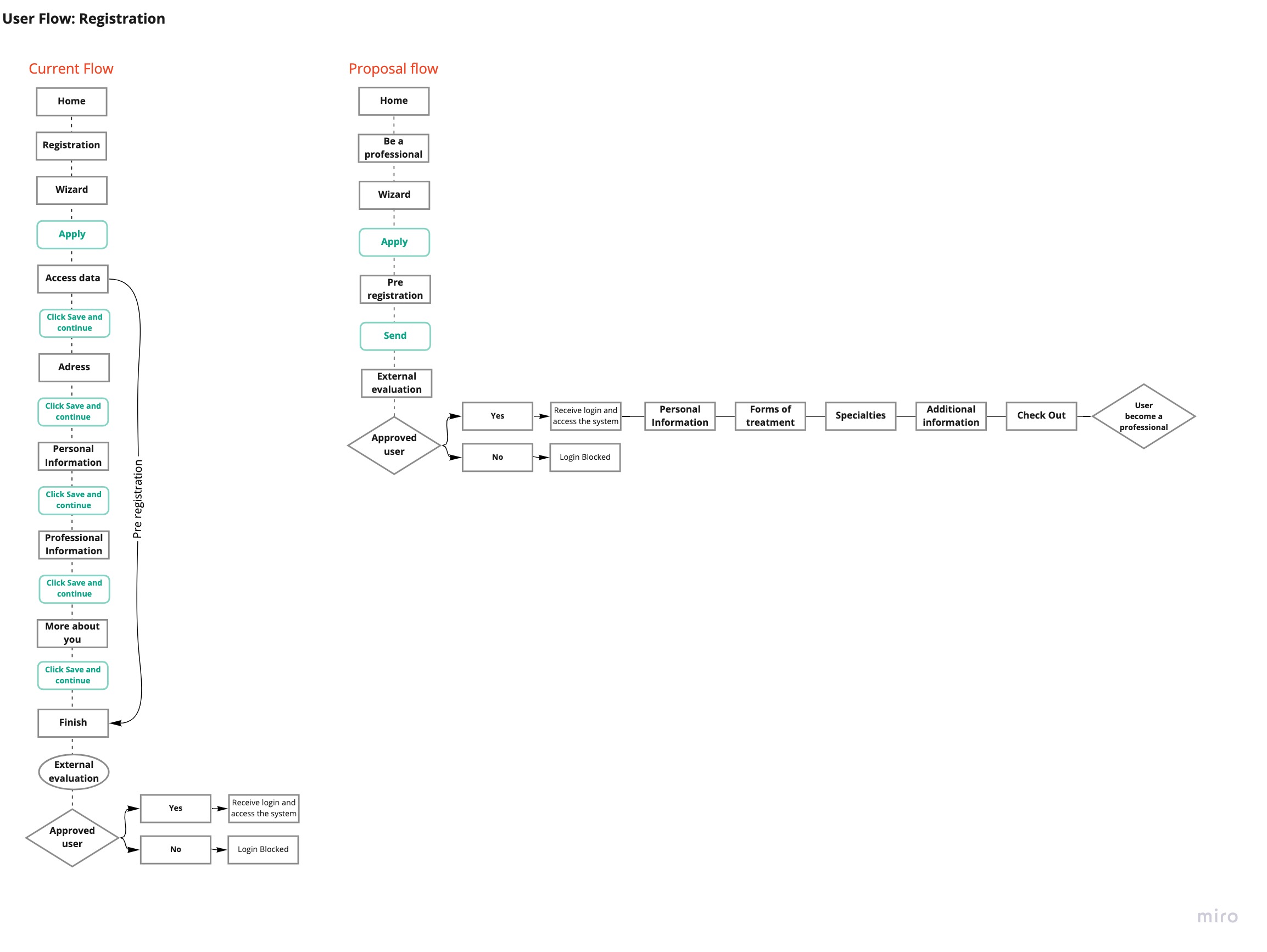
- Mobile-first wireframes — given 53% of traffic was on mobile, the flow had to read well on small screens first, then scale up.
- Clearer calls to action — removed ambiguity about what each step did and what came next.
- Fewer required steps — stripped unnecessary fields, gave users more control over when to fill what.
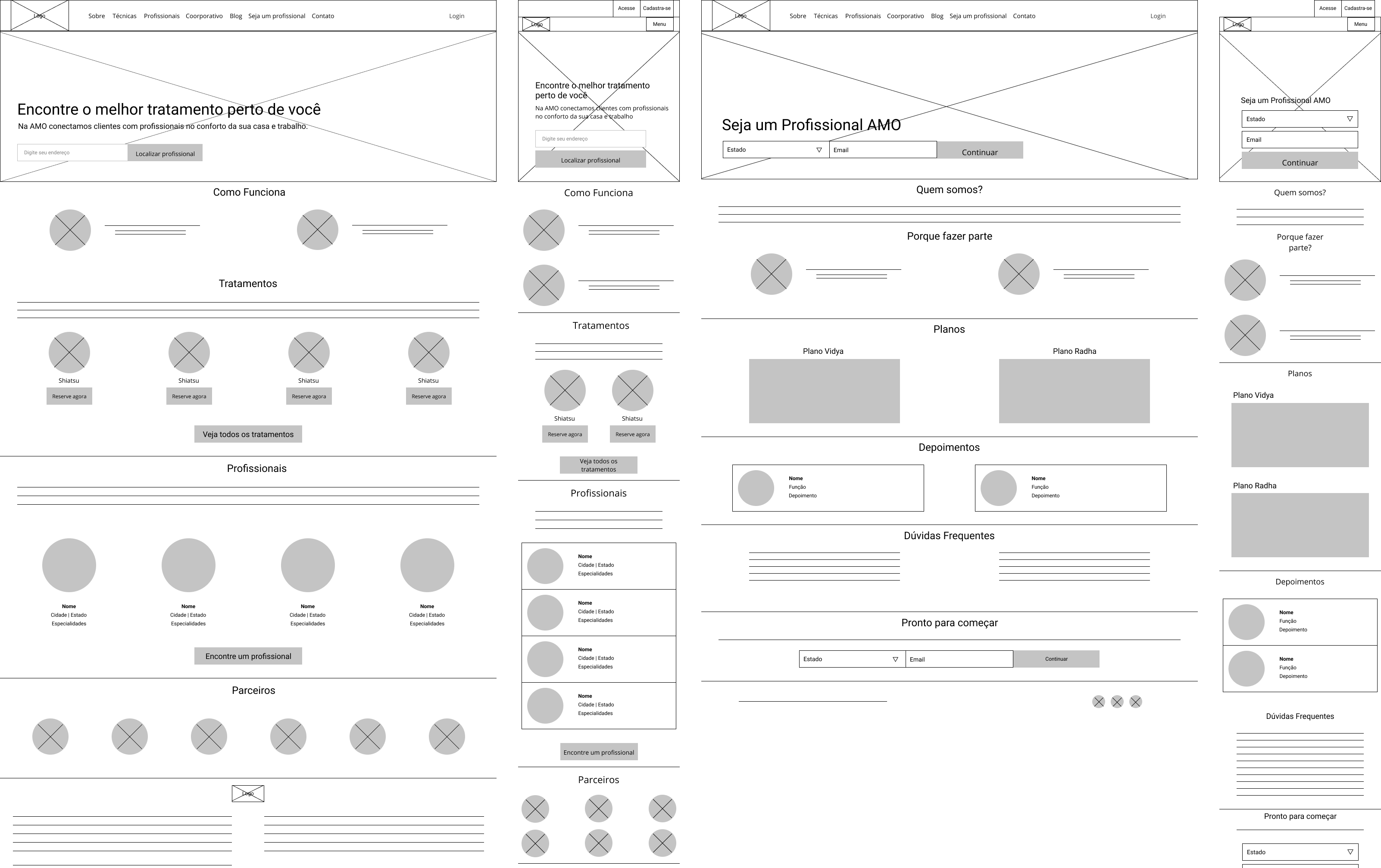
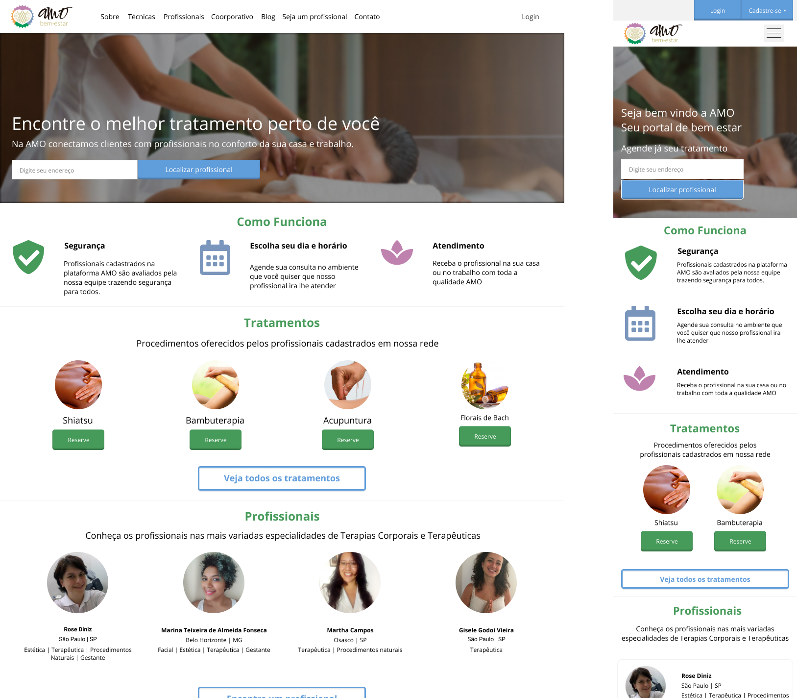
A validated flow — and an experiment that never ran.
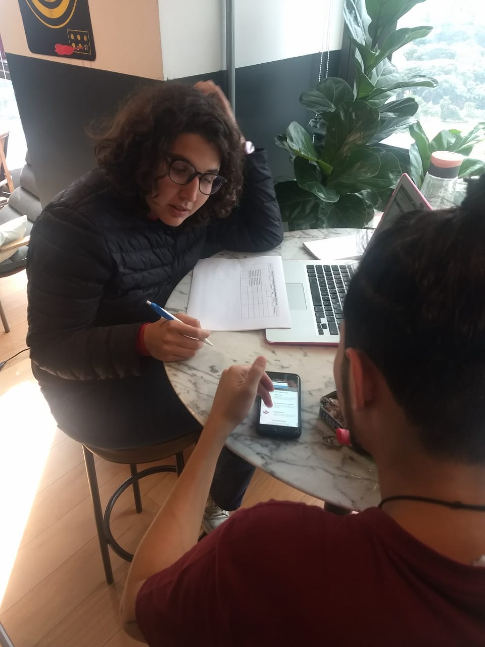
I went to Brazil to run usability tests in person with professionals. The new flow tested as more intuitive and usable: testers found the registration entry quickly and finished the sign-up in fewer steps without help. The team picked up the flow for development and scoped an A/B test against the existing funnel.
The A/B test never ran. Engineering ran out of capacity before it was built, so the new flow was never measured against the live one and I have no conversion numbers. What's here is the diagnosis and a design that tested well. Not a proven lift.
What converging methods taught me.
Three methods, one answer. Analytics showed me where people dropped off. Interviews told me why. The heuristic review told me what to cut. Any one of them on its own would have been arguable. Together they weren't.
Numbers ended the debate. Walking into stakeholder reviews with funnel data and traffic share instead of opinions changed how decisions got made. Mobile-first stopped being a discussion.
Going to Brazil was worth it. In person I could see the pauses and the second-guessing that a remote session hides. For a product that local, being in the room mattered.
Next case study