Case study·Mobile·Healthcare·2020
Most migraine apps offer a diary, not an answer. I designed a tracker that turns daily logs into a report for your neurologist.
Status: self-directed case study, not client work. Reached a prototype; a hybrid build was started with a developer but never released.
- My role
-
- Ran the research myself: 16 survey responses and 6 patient interviews
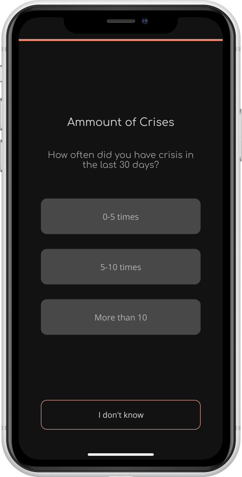
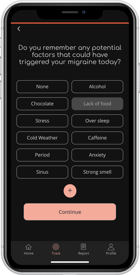
- Designed the symptom logging so it stays quick on a bad migraine day
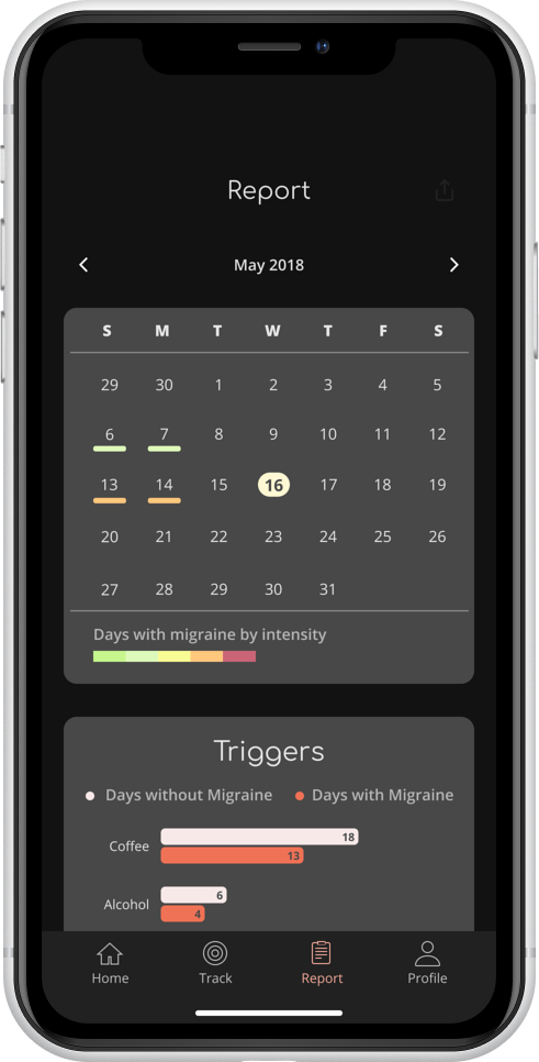
- Turned the log into a shareable report a neurologist can actually read
- Whole thing scoped to two weeks — one for UX, one for UI
- Impact
-
- Patients wanted causes, not records — the research reframed the whole product
- A prototype complete enough that a developer started a hybrid build from it
- Designed around symptoms rather than preferences, so it works when the user feels worst
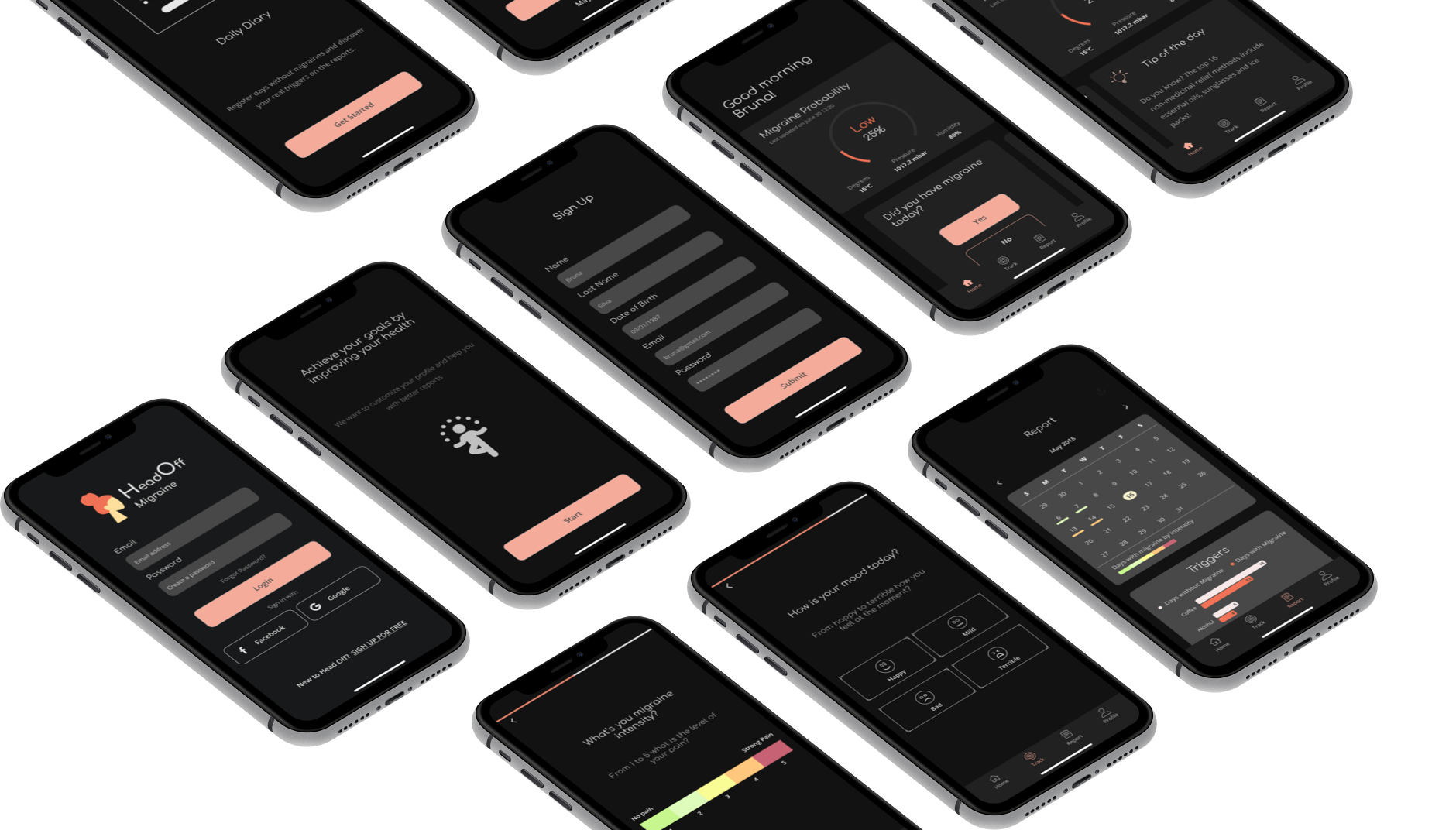
A diary isn't a diagnosis.
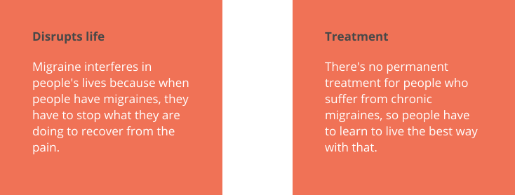
Migraine is the third most prevalent illness in the world. Existing apps offer migraine diaries — but they stop at logging. They don't help users see the pattern in what they log, and they don't produce something useful to bring to a doctor. The opportunity was the analysis layer: connect daily symptom data to likely triggers, and turn the result into something a neurologist could actually use.
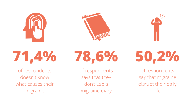
16 survey responses, 6 interviews — patients and neurologist.
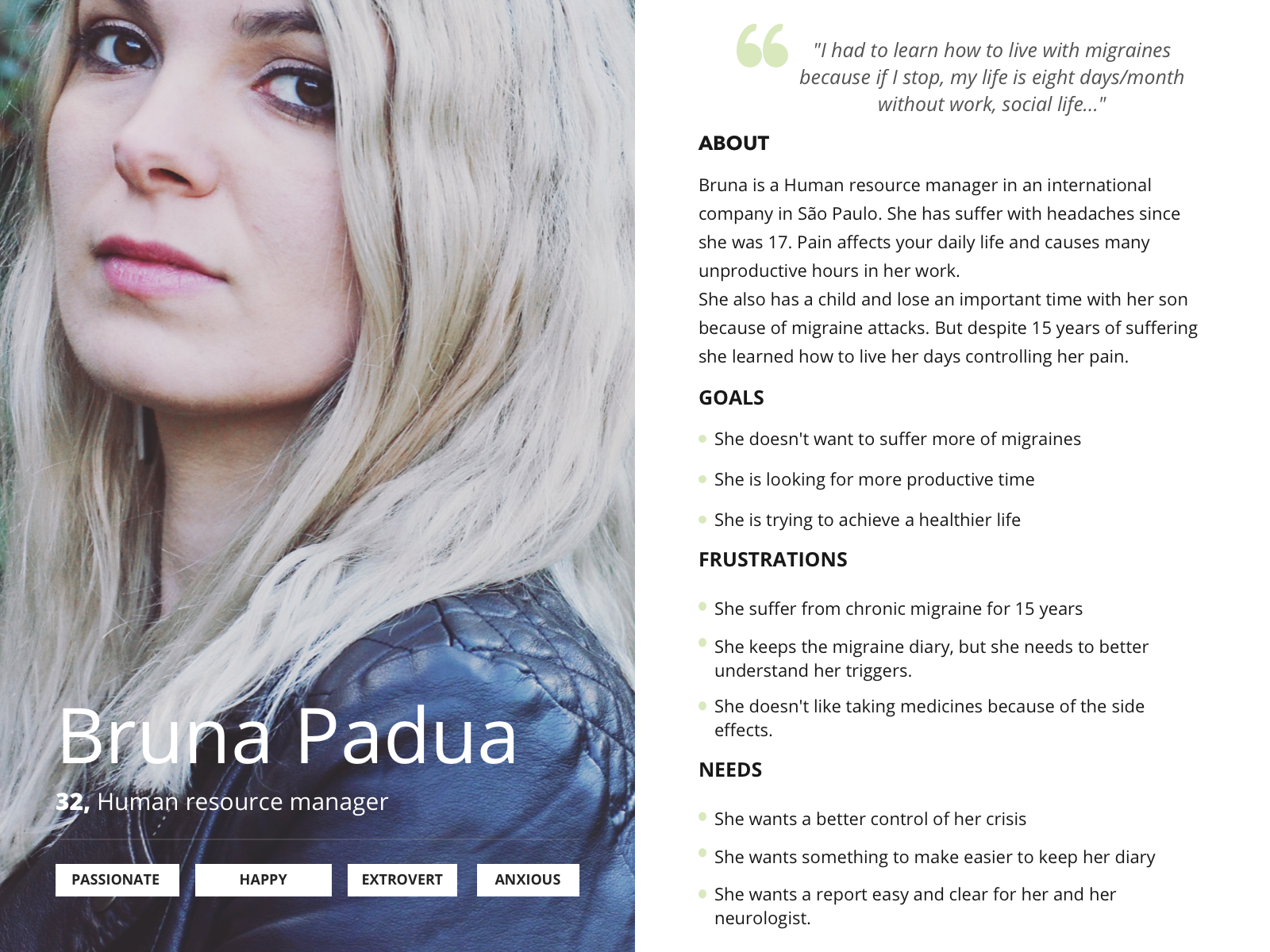
I ran a mixed survey and interview round — 16 survey responses on behaviours during a crisis, then six interviews including a neurologist for the clinical view. Affinity mapping pulled the findings into themes around pain, pattern recognition, and what makes a useful conversation with a doctor.
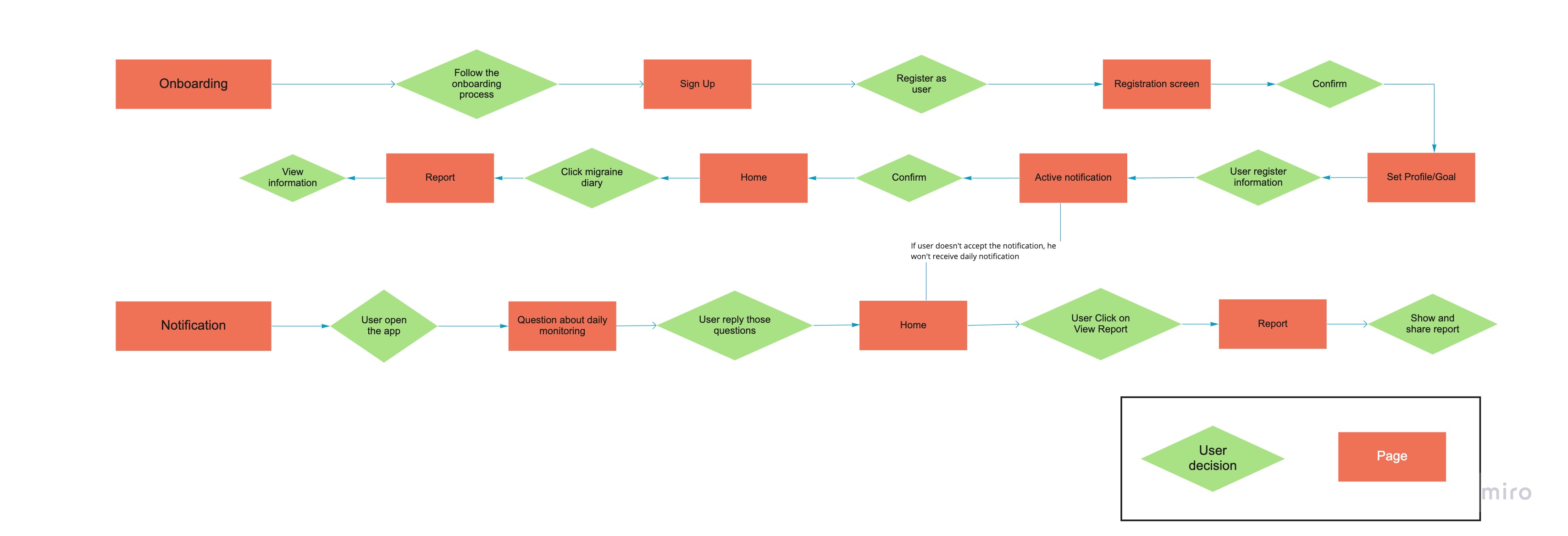
Log the day, get a report, share with the doctor.
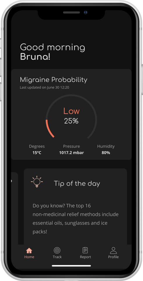
The MVP focuses on one loop: users enter daily information about activities, food, sleep and other potential factors. Over time, the app correlates entries with crisis days to surface candidate triggers. The result is packaged as a meaningful report the patient can take to their neurologist — moving the conversation past "I've been having more headaches" toward something specific the clinician can act on.
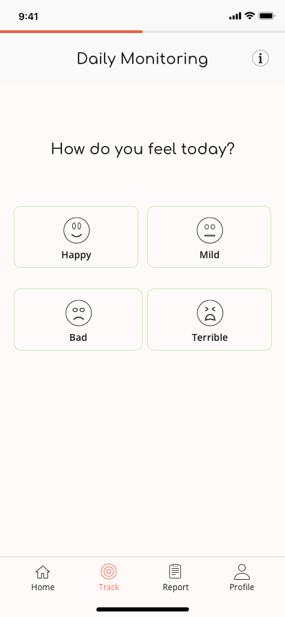
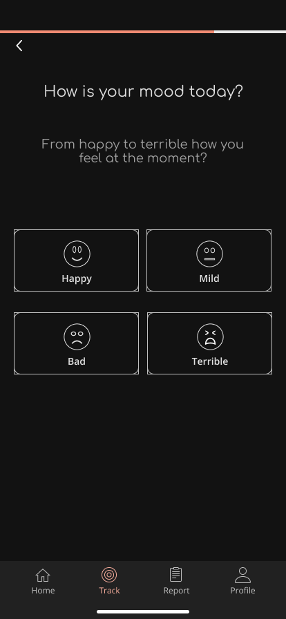
A dark mode wasn't a preference — it was a requirement.
The biggest design lesson from prototype testing came from users themselves: photophobia (light sensitivity) is a core symptom of migraine. A dark mode wasn't a styling option, it was a baseline expectation for the people who'd actually use the app. Copy testing surfaced a second issue: jargon. I rewrote the entries against the way patients actually described their symptoms, not the way a designer might.
Toward a shippable hybrid.
I took the design to a developer to build as a hybrid app, with first users lined up to test core features before a wider release. Testing stayed focused on the report — the part of the product that had to read well to both patient and clinician — and the plan was to A/B test the variants under consideration. That test never ran.
Designing for symptoms, not preferences.
Healthcare UX is about constraints, not aesthetics. The dark mode lesson is the one I think about most. Without user research, I'd have shipped a light-only interface that the actual users — people in active pain, light-sensitive — couldn't use. The discovery loop saved the product.
The doctor is also a user. The report screen isn't for the patient alone — it's the artefact the neurologist reads. Designing it meant talking to a clinician and asking what kind of summary makes their job easier, not just what feels reassuring to the patient.
Plain language beats clinical language. Copy testing revealed how often I'd reached for medical terminology instead of how patients describe what they feel. Rewriting against patient language made the tracking faster and more accurate.
Next case study