At GRESB building new pages and reports was taking a long time and effort. We often ended up rebuilding similar solutions with small differences. This not only wasted our time but also affected our users. The inconsistent designs not only made it hard for users to quickly understand and use features in our reports but also led to more bugs, lowered the quality of our work, and caused missed delivery dates.
Led the creation of our first design system, ensuring alignment between UX, development, and data science teams. Managed stakeholder expectations and needs through focused research, starting with implementation in one project before expanding to others.
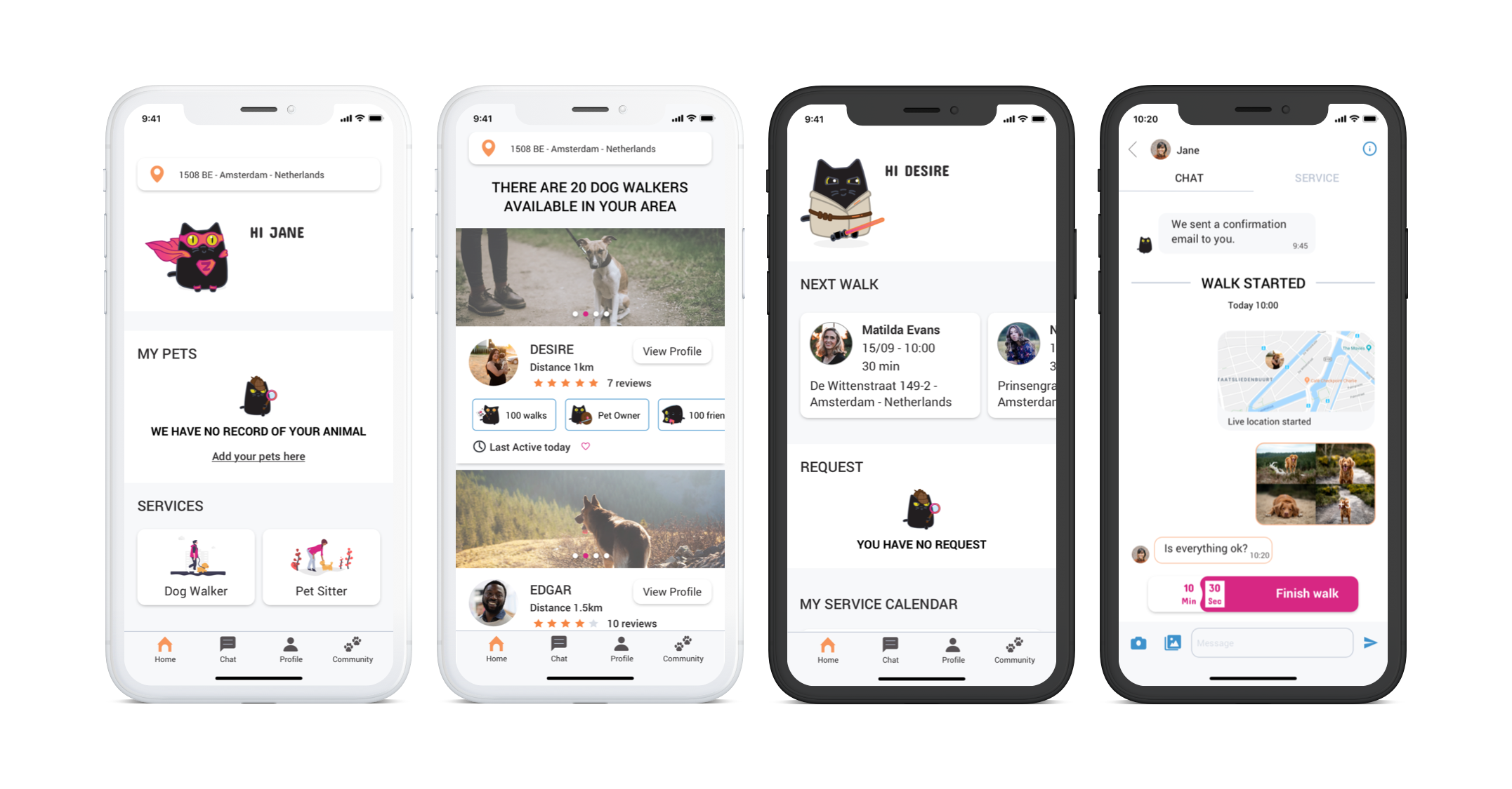
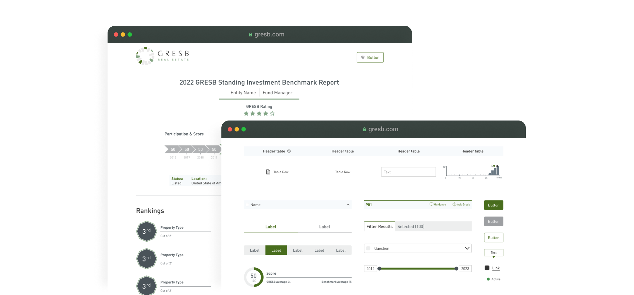
All GRESB Reports (Benchmark, SFDR, Transition Risk, TCFD Alignment and Portfolio Analysis Report)
GRESB is a organization that evaluates and scores the sustainability practices of Real Estate and Infrastructure companies, providing ESG data to investors.
2021 / 2022
I initiated and crafted GRESB's first-ever design system. This involved collaborating with business stakeholders, data science, and developers.
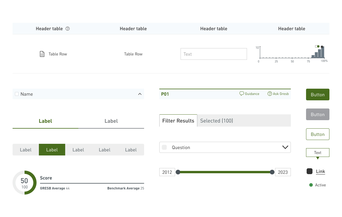
In developing the new design system, I created the Figma library by identifying patterns, while the team simultaneously front-end components and used them to construct new reports.

Let's dive into the real impact of the new design system at GRESB. These numbers and metrics show how our changes made a significant difference in our development process and user experience.
After mapping out all the pieces, I saw we needed to make everything look more unified. The first big task was to find ways to link all these design pieces together.
Optimizing Colors
The first step was tackling our color scheme. We had to maintain two separate color sets to distinguish between
different types of products. This was challenging but necessary for clarity. So, we established 'base' colors
that were consistent across all designs and 'theme' colors that varied depending on the specific product line.
This approach kept our designs distinct yet harmonious.

Standardizing Typography
I then addressed the typography, ensuring we had consistent text sizes and selecting an easy-to-read font. These
changes were aimed at creating a uniform appearance and improving readability.

Guidelines for Tokens
Rules for spacing, border, sizes and other design elements were also set. Proper definitions is crucial for
clear, uncluttered visuals. This part of the process was about making our designs look good and work well.

Incorporating Accessibility
It was important to factor in accessibility during this stage, ensuring our designs were usable by everyone,
including people with disabilities. To do that I looked specially on color contrasts and text sizing, making
sure we had a inclusive design.

Standardizing Components:
Once we had the foundations ready, I began refining our
components. This wasn't just about aligning with our new standards; it also involved merging similar components
and simplifying others to eliminate any redundancy. This optimization ensured each component was purposeful,
unique, and contributed to a more efficient design system.
Classifying Components:
Finally, I sorted our components based on their purpose, such as
forms and graphs. This categorization process was essential to understand the frequency of use and the
standardization of components. It helped create a comprehensive library that was intuitive and free from
redundancies, facilitating a smoother design process.
Integrating Bootstrap:
Bootstrap was chosen for its adaptability and familiarity.
Customization were made to align it with our new design system.
Teaming Up with Developers:
With the design guide ready, I collaborated with
developers, assisting them in translating designs into functional elements and build the documentation around
the usage.
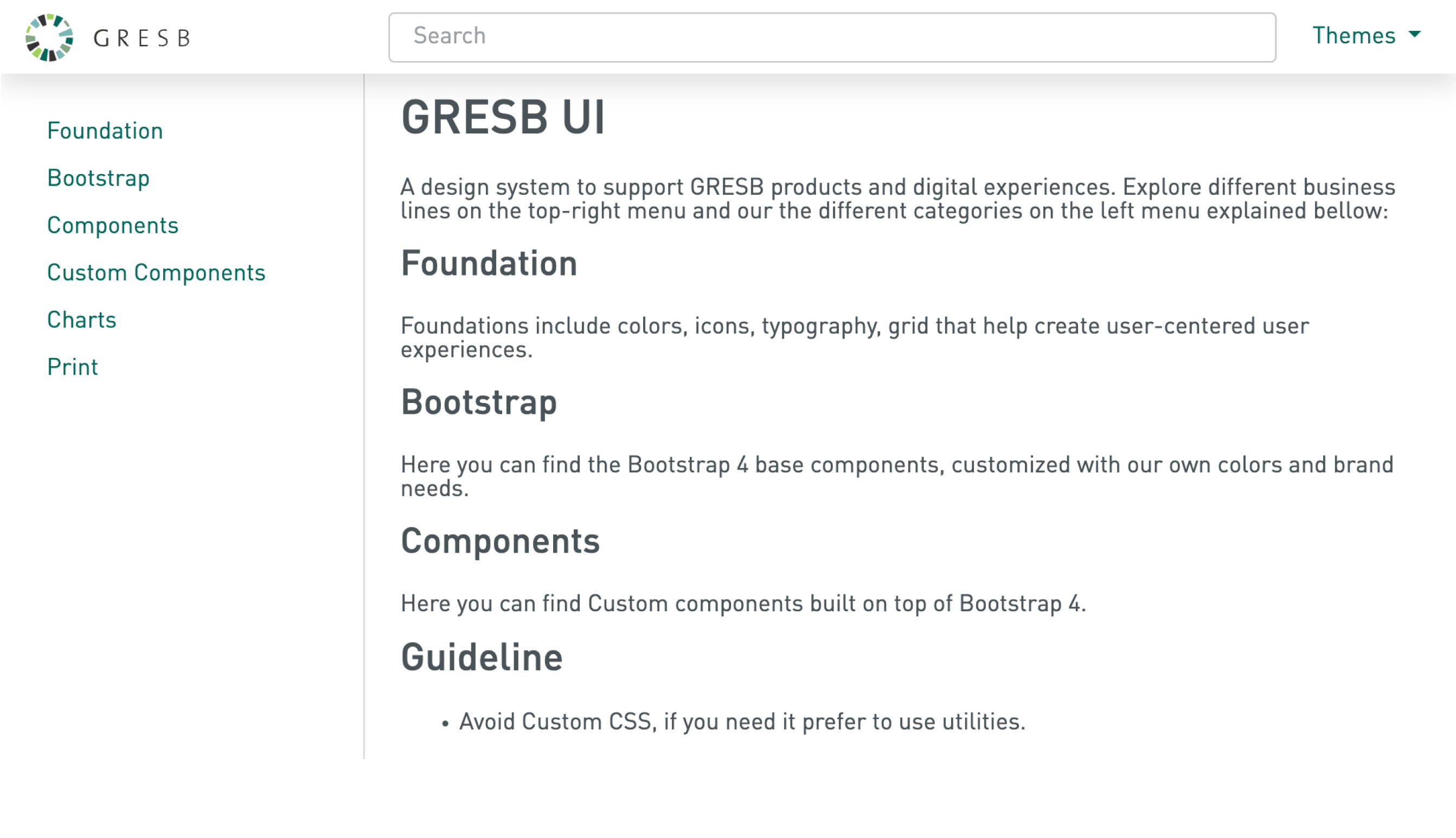
GRESB UI | Front-end library documentation
This project was more than just the creation of a design system; it was a journey that sharpened my skills, expanded my perspective, and taught me the value of continuous learning and adaptation in the field of design.
Balancing Flexibility and Consistency
It was vital to learn how to strike a balance
between the demands of consistency and flexibility. The ability to adjust to various product categories with
distinct theme colors taught me the skill of adaptable design inside a structured framework, even if maintaining
a consistent appearance and feel was still crucial.
Adherence Challenges
The design system adoption was very successful in terms of report
construction and new product development. However, although we achieved full adoption of the Figma library for
components and tokens in the design aspect, the development side faced challenges with older systems. Due to
being built on older solutions, the developers were reluctant to adopt the new library in these cases.
Nonetheless, we are still implementing the design system in these older systems, but they lack the simplicity in
reusing components.
Value of Simplification
Simplifying components and removing redundancies was a
significant learning curve. It taught me that less is often more in design. This approach not only made our
design system more efficient but also easier for other team members to understand and use.
Documentation and Knowledge Sharing
Though I documented the design process, more
detailed documentation, particularly around the rationale behind certain decisions, would be beneficial. It
could serve as a valuable resource for new team members and help in maintaining consistency in the long term.