Case study·Mobile·Two-sided marketplace·2021 — 2022
On GO APP PET, booking a walker meant trusting a stranger. I redesigned both journeys around trust signals — and every tester completed a booking.
Status: validated with users, never shipped. COVID-19 paused the startup's development before release.
- My role
-
- Redesigned both sides of the marketplace as separate owner and walker journeys
- Rebuilt the walker profile so an owner could judge who to book
- Ran moderated usability testing with 8 participants before build
- UX Designer, freelance, with stakeholders across business and tech
- Impact
-
- 8 of 8 completed the booking first try — 6 of 8 managed it in the original app
- 7 of 8 felt more confident choosing a walker
- 8 of 8 found the redesign clearer and easier to use
Sign-ups were healthy. Bookings were not.
GO APP PET connected dog owners with walkers, but despite users registering, the conversion to a first booking remained low. Owners hesitated — there wasn't enough information to trust a stranger with their dog, and the communication felt scattered. Walkers, on the other side, struggled to stand out and keep clients engaged.
Understand both sides before designing either.
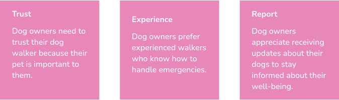
Following the Double Diamond, I started in discovery. I ran 34 survey responses and 7 interviews with dog owners and walkers, guided by three core questions: tell me about your last experience finding a dog walker; what do you expect as a pet owner; what do you look for when choosing one.
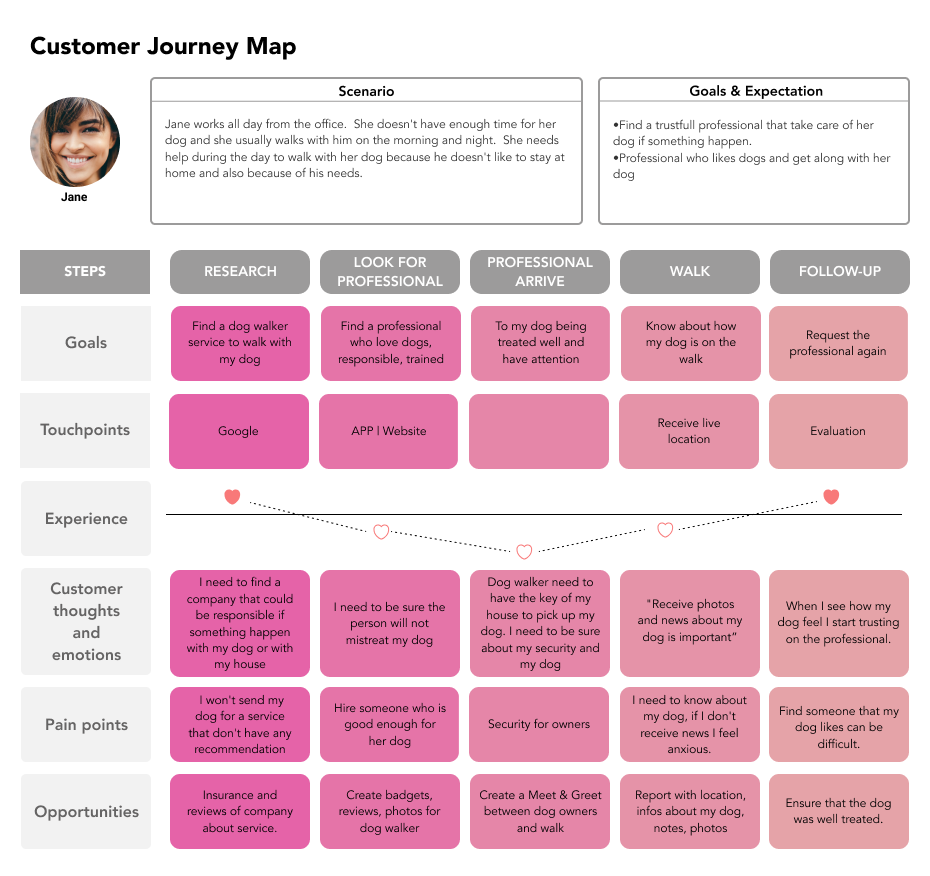
I synthesised the findings with affinity mapping, then translated them into two personas and a journey map for the owner side:
- Jane (dog owner) — looking for reliability, transparency and clear communication.
- Desire (dog walker) — looking for better client engagement and a smoother experience.
Two journeys, one platform, a chatbot to hold them together.
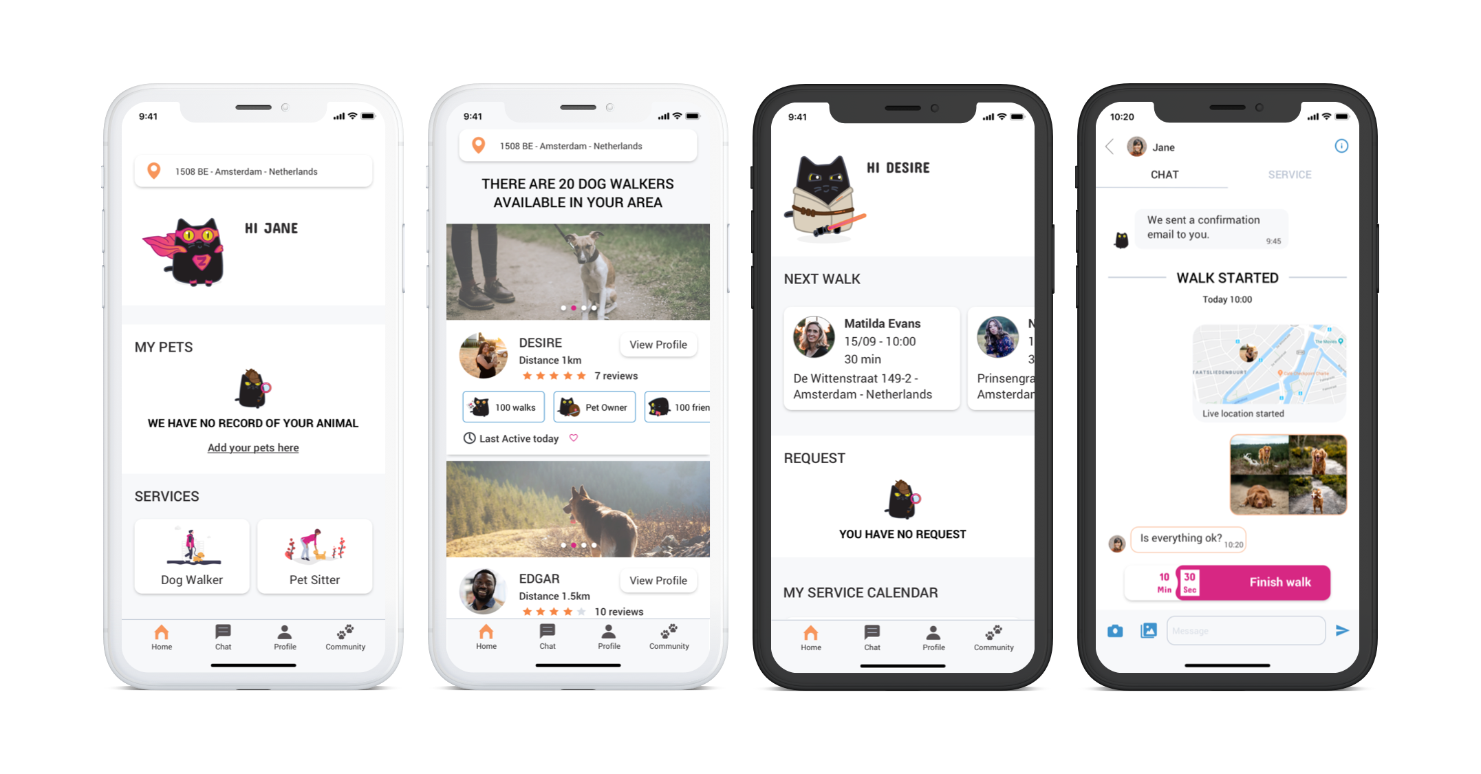
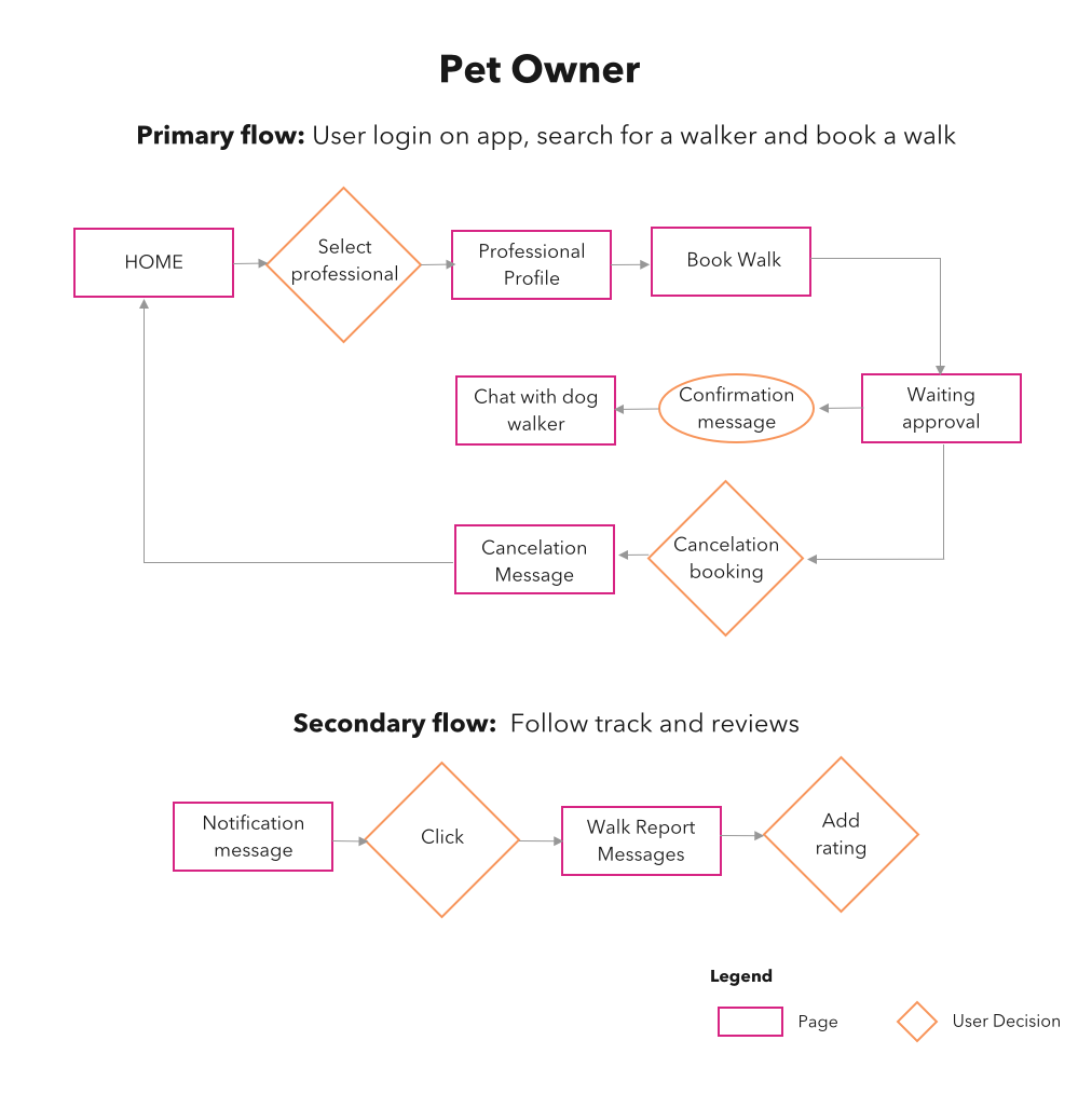
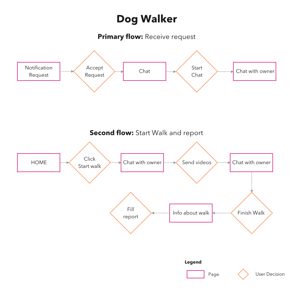
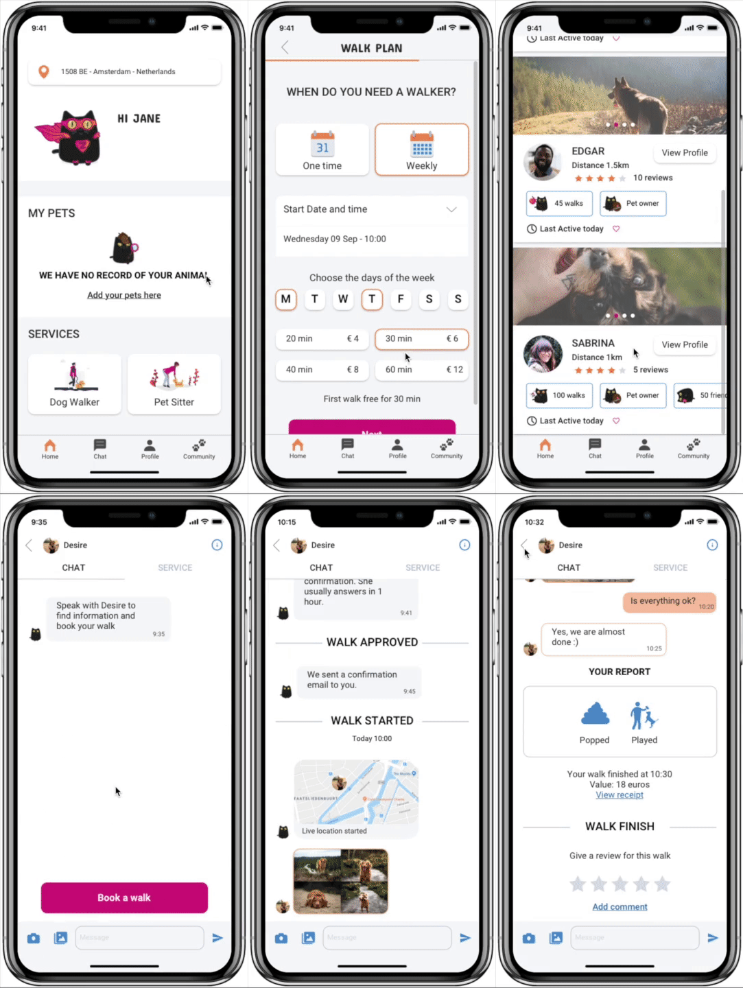
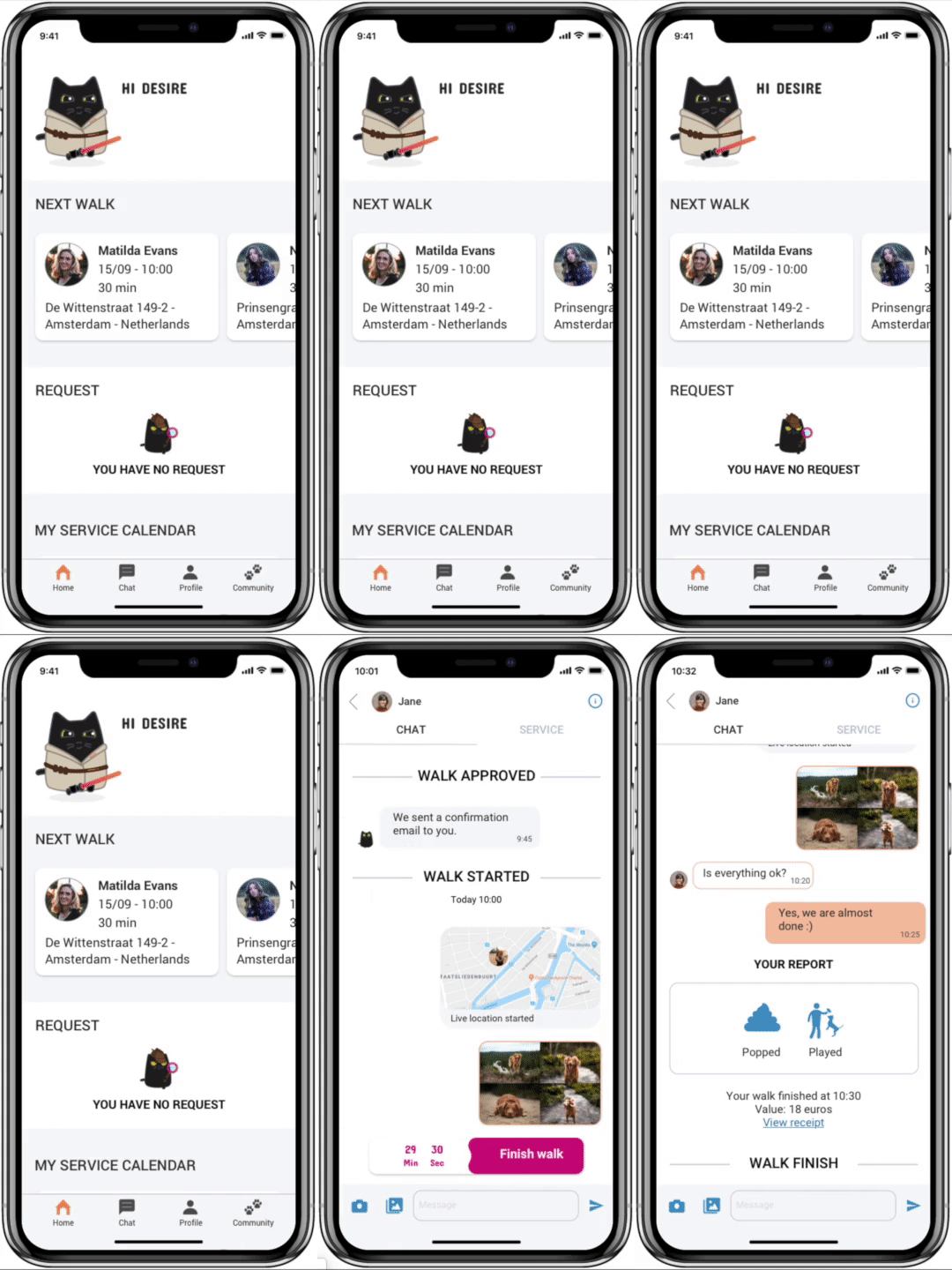
The research pointed to three moves. First, split the experience: owners and walkers needed different home screens, different priorities, different proof. Second, give owners more to evaluate — full walker profiles instead of thin cards. Third, centralise the messy middle of booking → walk → report inside a single conversational surface.
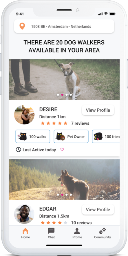
- Owner profile of the walker — bios, history and reviews, visible before the booking decision.
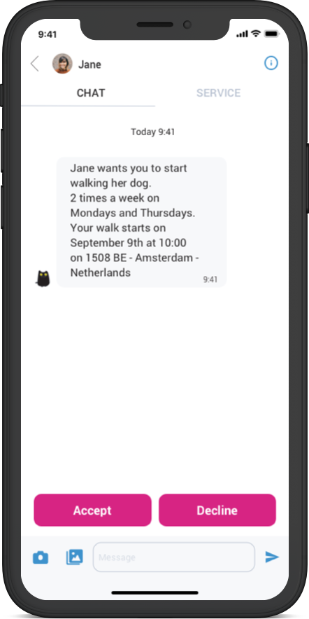
- Go App Bot — a chatbot that guides users from hiring through to post-walk reports, so communication doesn't fragment across screens.
- Separate flows for owners and walkers — each side sees the features that matter to their role.
From sketches to a tested prototype.
I worked through the standard fidelity ladder, validating at each step before moving deeper: paper prototypes and guerrilla testing first, then mid-fidelity wireframes to refine navigation and hierarchy, then a Marvel prototype for usability testing.
Trust, clarity, completion — in testing, with eight users.
I ran a moderated usability test with 8 existing app users, comparing the redesigned flow against the live one. The lift was clear on every dimension the team cared about — owners felt safer choosing a walker, and the booking flow completed without friction.
- 8 of 8completed the booking on the first attempt — 6 of 8 managed it in the original app
- 7 of 8felt more confident choosing a walker with the new profile features
- 8 of 8found the redesigned experience clearer and easier to use
Eight people, in a moderated test. These aren't production numbers — the redesign never reached users at scale, because COVID-19 paused the startup's development before release. So I can show you the direction and the evidence behind it. I can't show you business impact.
What I'd carry into the next two-sided product.
Two sides, two flows. The biggest change wasn't a screen or a component. It was deciding that owners and walkers shouldn't share a home page. After that, most of the other decisions answered themselves.
Trust happens before the booking. Nobody hands over their dog based on a name and a price. Putting reviews, history and a bit of personality into the walker profile moved the decision earlier.
Small team, same rules. Working next to the founders, the business side and the developers kept me honest about what could actually get built.
Next case study