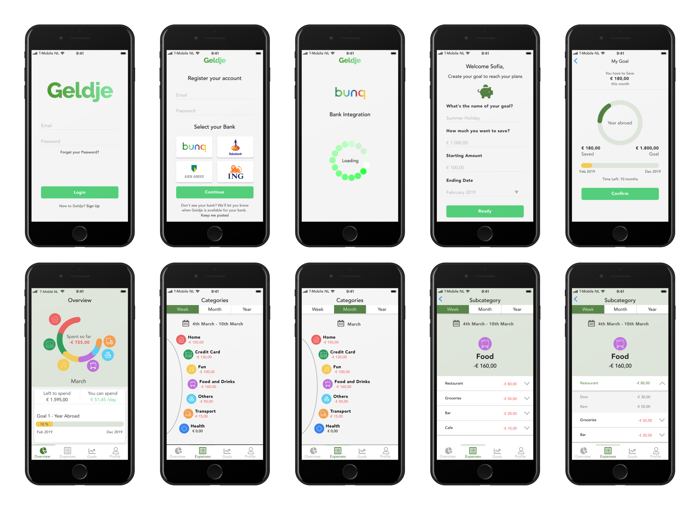
A UX Case Study called “GELDJE” an app focused on real-world needs for users who want to better manage the future of their money and understand expenses. Today people use different ways to control their money, sometimes spreadsheets, other times apps but usually, it involves manual processes. People who have problems saving money need a better way to control their expenses, learning how to achieve financial security. Come with me through this journey to understand behaviors and solve problems in the personal financial management world.
UX Researcher, UX Designer & Interaction Designer
Figma, Miro, Marvel & Sticky Notes
Market research, Interviews, User flow, Wireframes,User Journey & Agile Development
Mobile
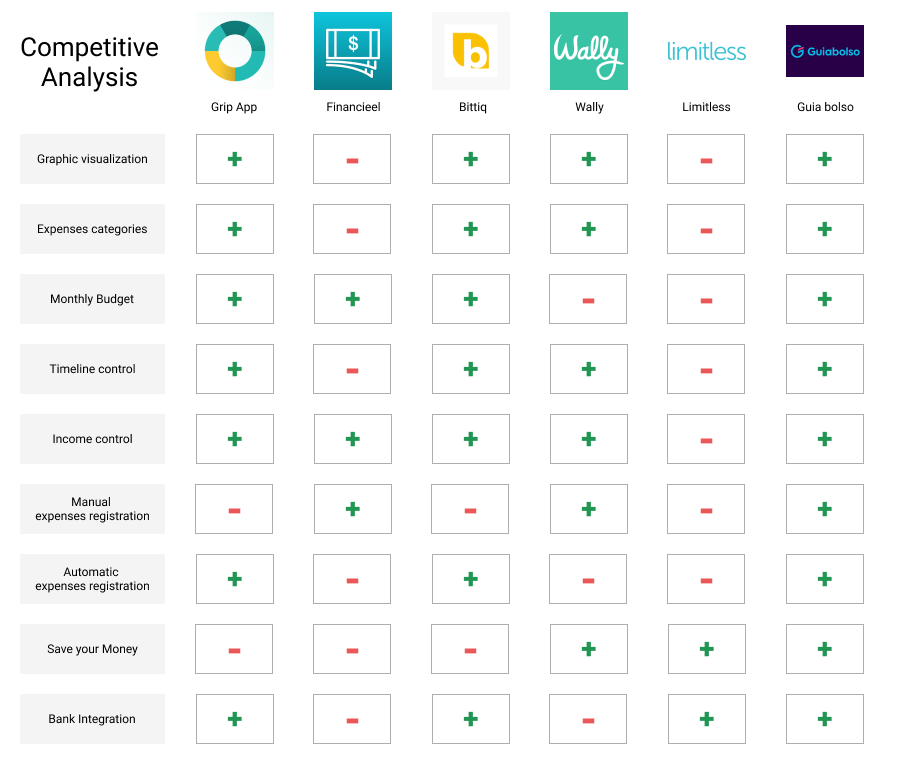
Analyzing the results of my research, I understand most apps can help users to control their expenses, but I couldn’t find an app focused on features to help users saving money to achieve their life goals.
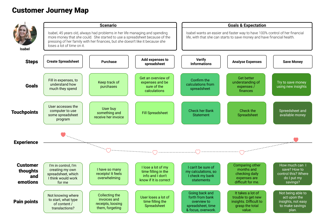
Isabel wants to find a way to have 100% control of her finacial life and also find a way to save money, but today she control her finance with spreadsheets. Behind her pain points lay the design opportunities that inspired the features of the MVP.
Create an application that integrates information into your bank account through APIs, helping users to save money for a specific purpose through adding goals and also provide information about your expenses using category-based list.
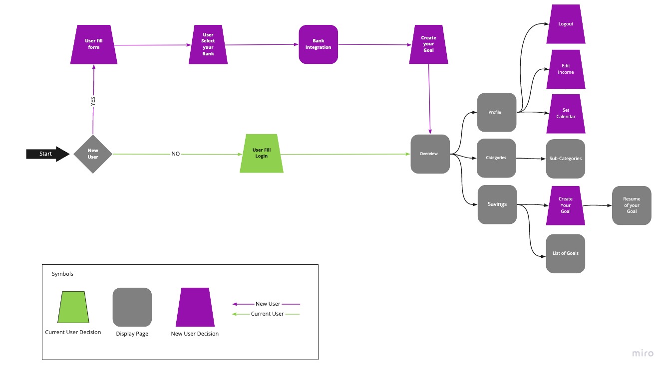
Inspired by the research, I started the design from scratch, sketching my ideas for the core experience trying to translate it to content and main tasks on the screens.
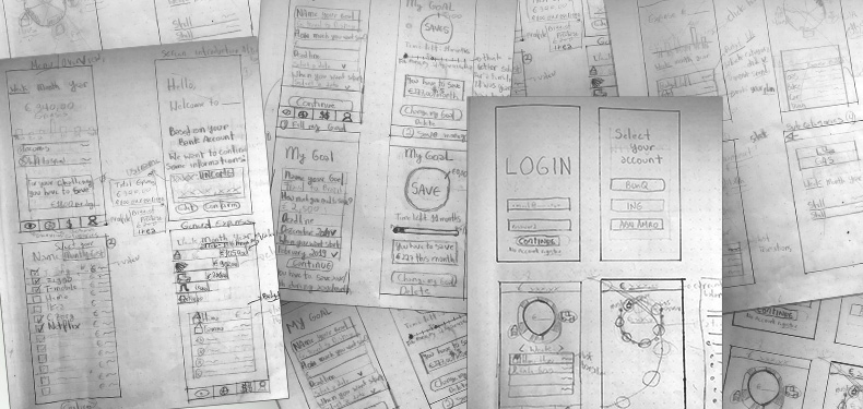
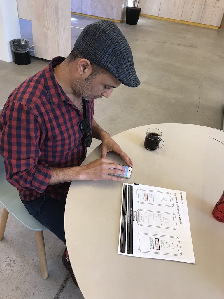
To get insights for the application’s usability, I worked in a paper prototype building the flow for the user to complete the following tasks:
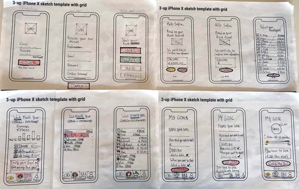
After making changes and retesting our paper prototype, we created Mid-fidelity wireframing in Figma.
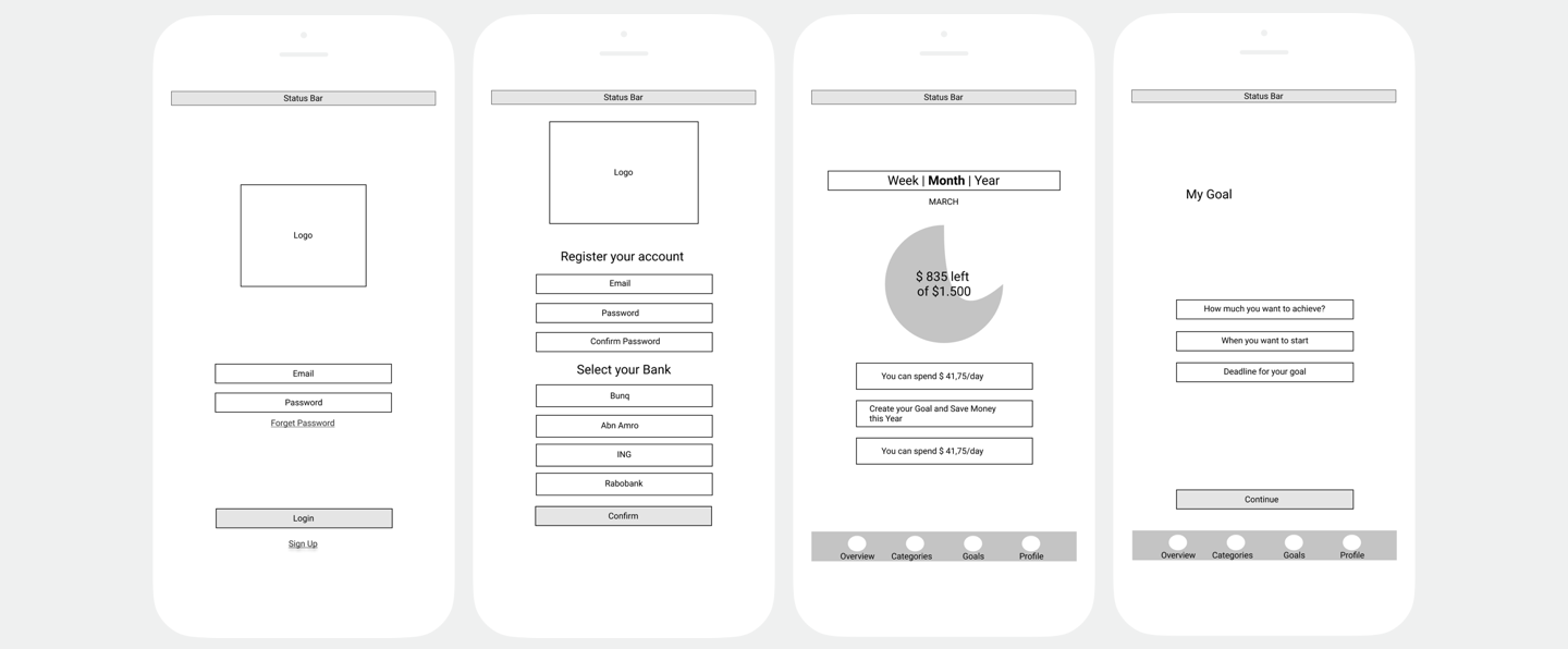
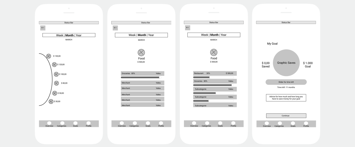
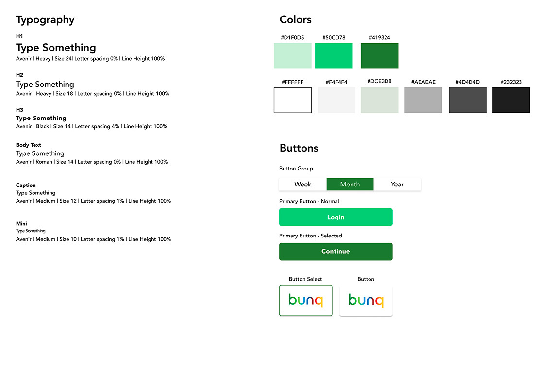
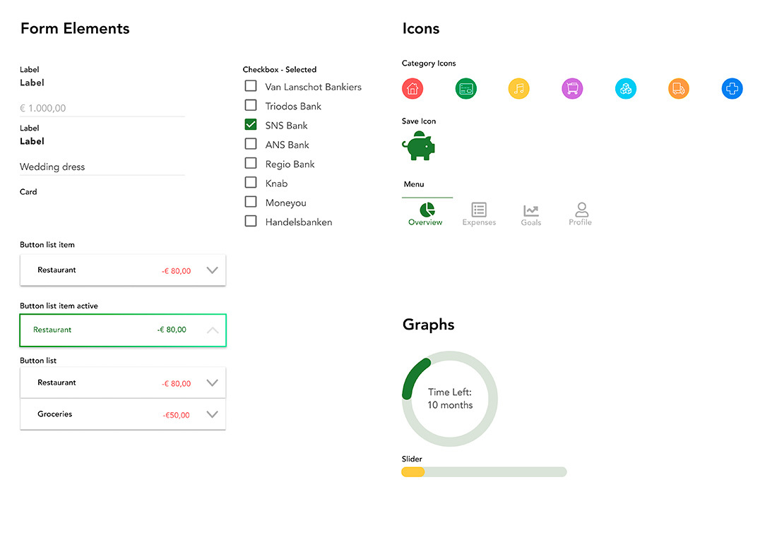
The MVP solution was to create an app to track finances and help people to achieve their goals.
Try prototype
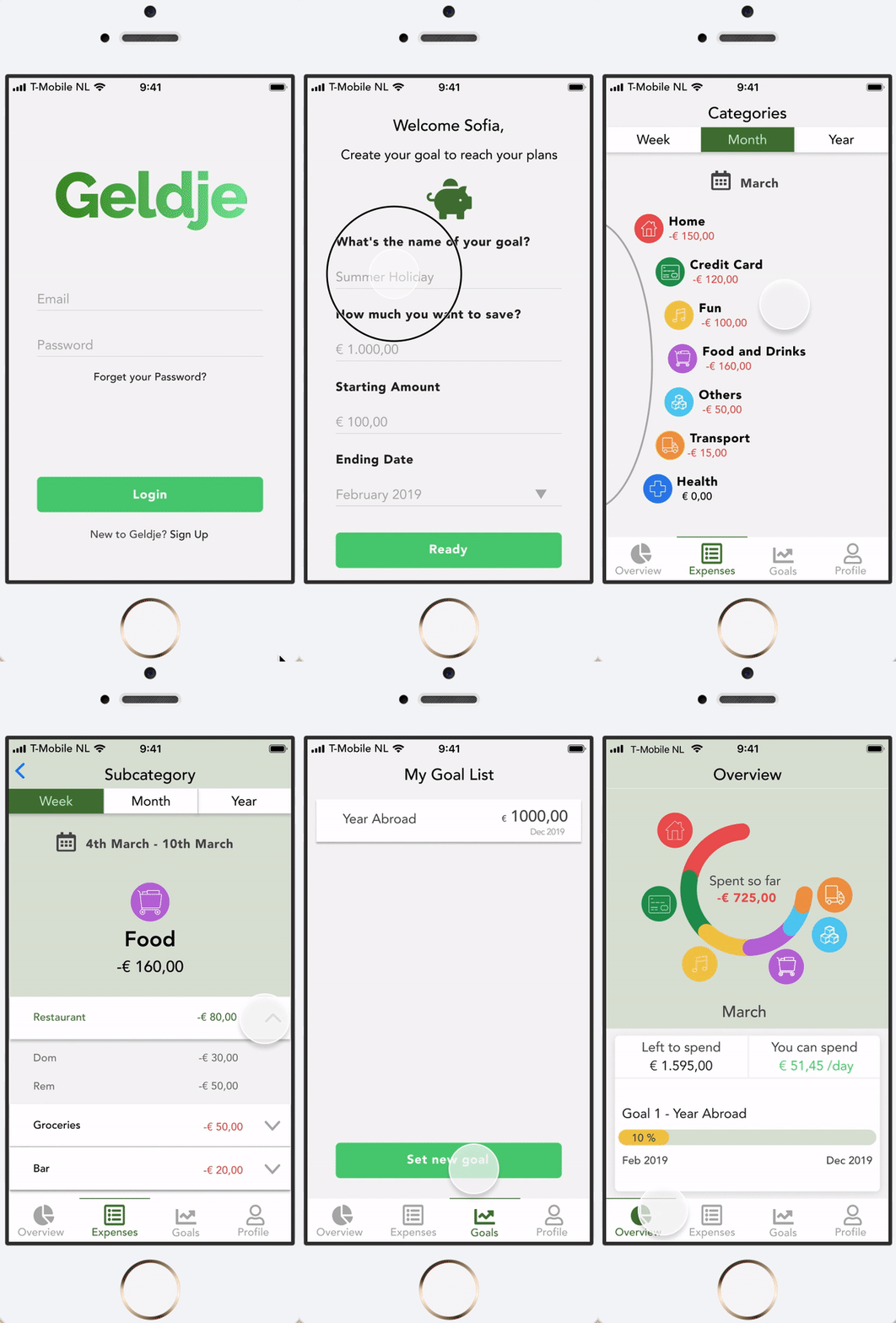
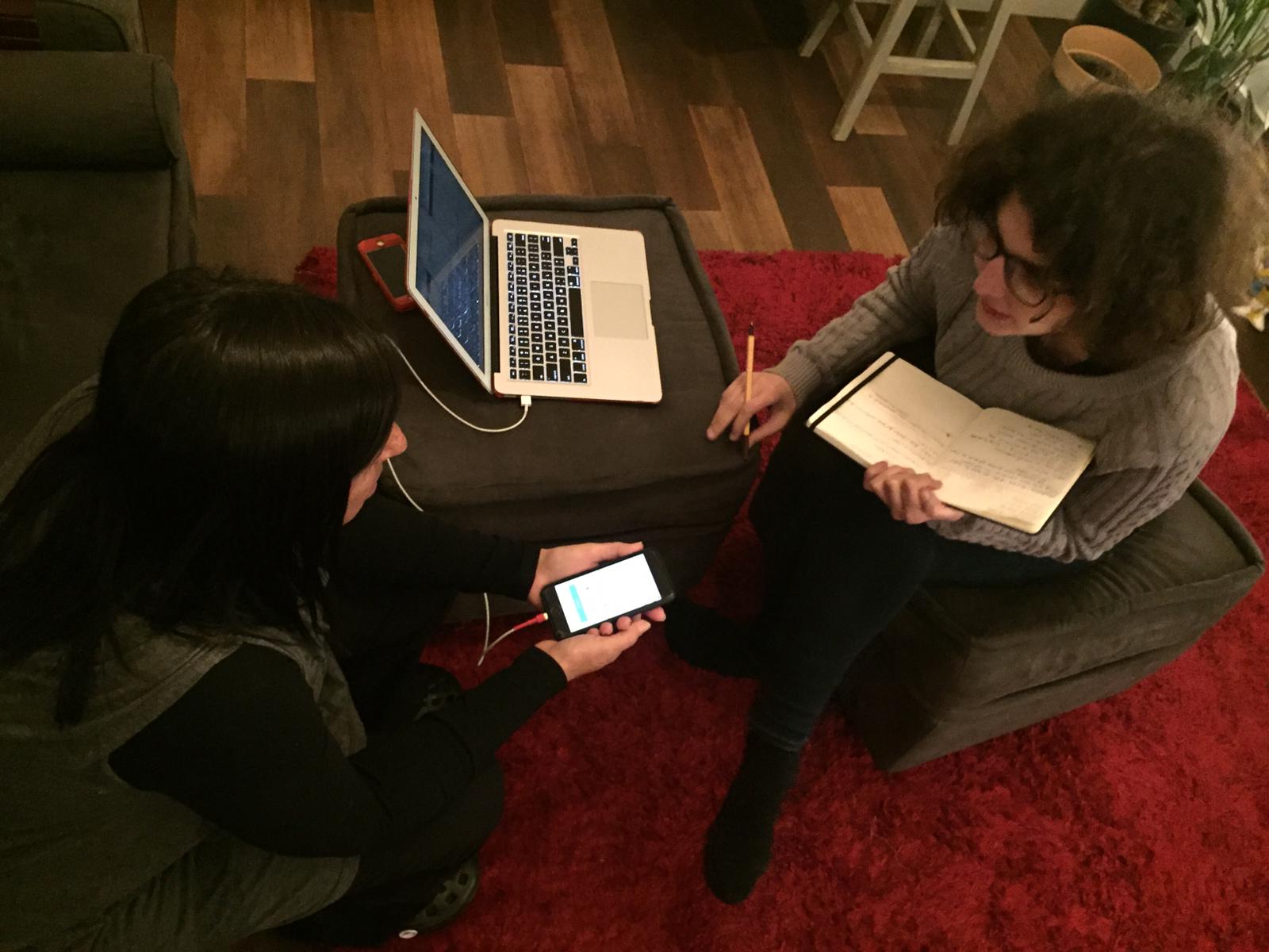
I invited five people from different nationalities between 25 and 55 years with different experiences in their financial management, that way I could analyze their perspectives against their profiles, observing pain points and assertions on usability and desirability of the product. In order to have a clear process to follow and compare results, I asked the users to complete 3 main scenarios:
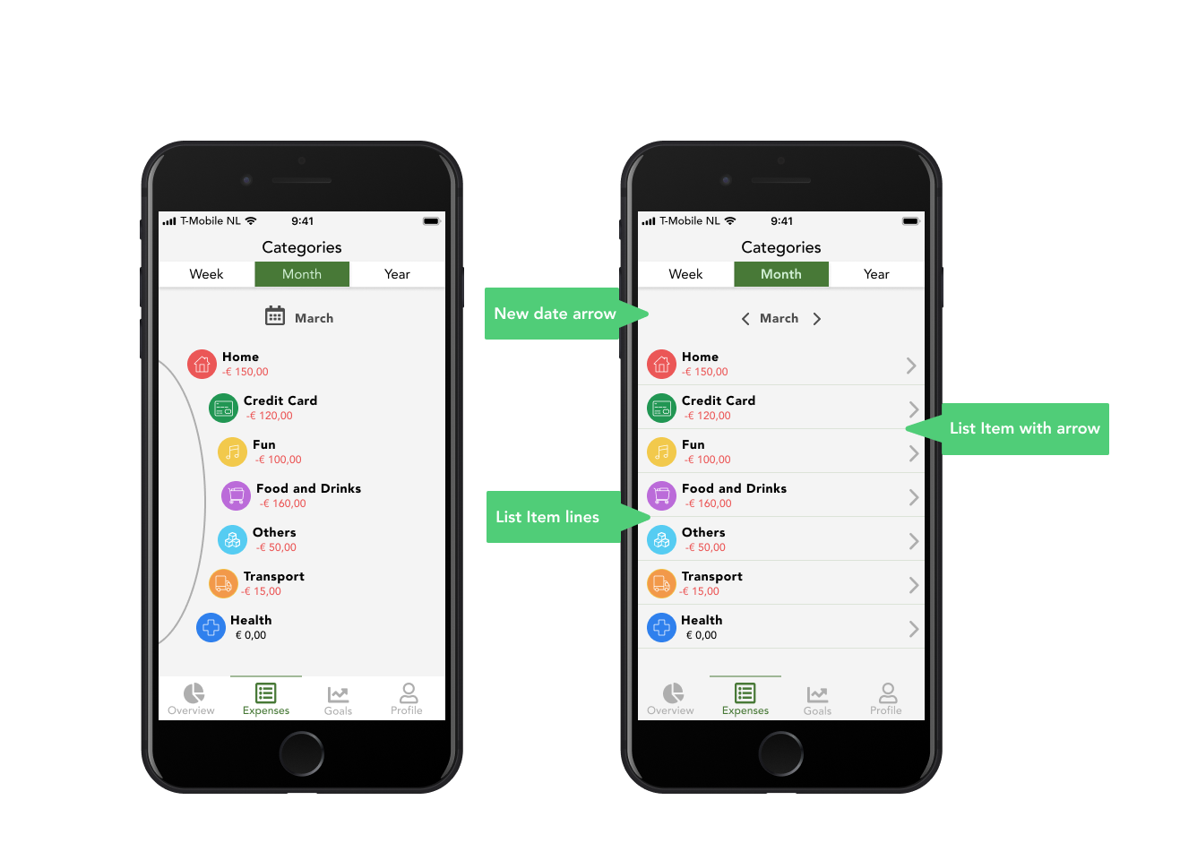
After the test, with all the results I decided to redesign the category screen on of the highest priorities on my user testing since the users are not able to understand and go to subcategories, after that, I tested with more 02 users to validate the idea and I could get feedback about the new design.
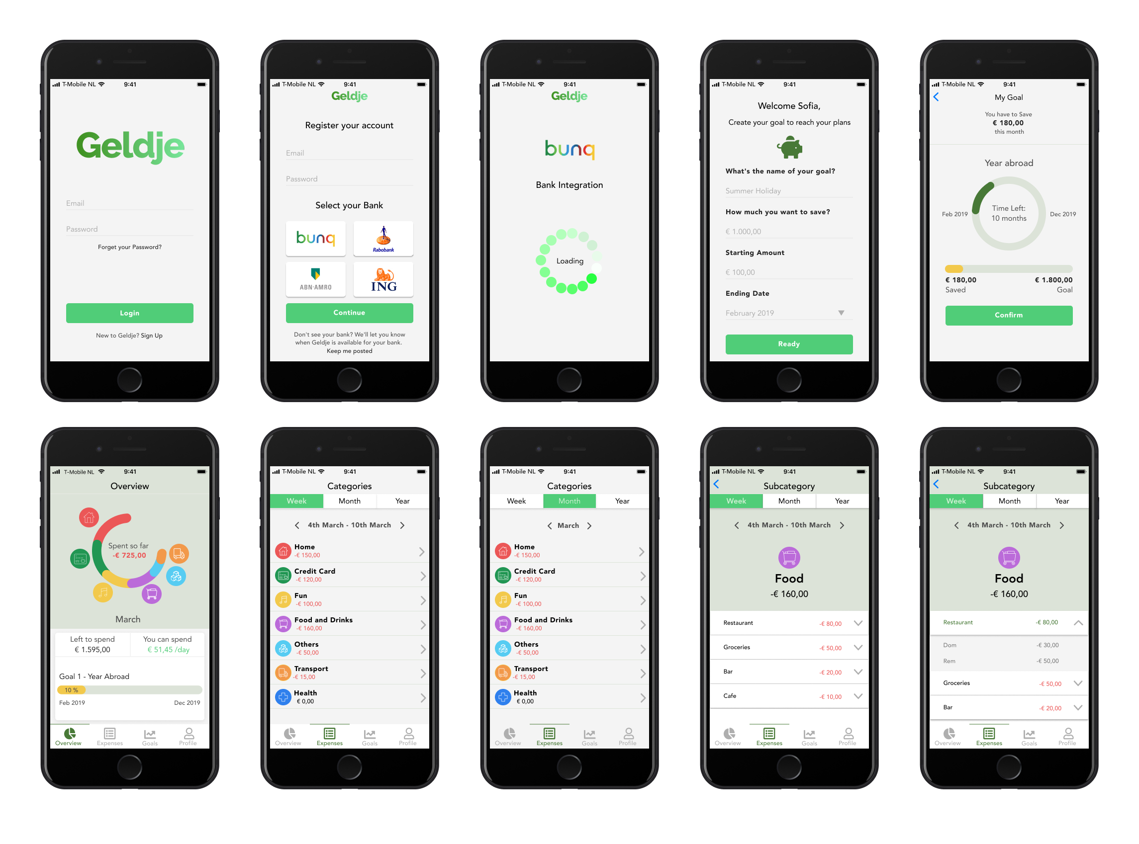
After all this process I could observe some flow improvements but overall the users gave me good feedback regarding the usability and desirability of the app, from 5 people just one said that already have a way to save money and have no interest in using the app, but even him could complete all designated scenarios, and see that for people who don't have clear control of their finance the app could be useful.